Deep Dive
A rebrand for the elegant, moody bar inside Seattle Amazon Spheres that honors the otherworldly interior, classic cocktails, and high quality service, while developing its identity as a deep-sea cave of wonders.
- Timeframe: 11 weeks
- Collaborators: Rolph Artieda
- Roles: Branding, Logo Design, Environmental Graphics, Layout
- Skills: InDesign, Illustrator, Photoshop
Challenge
In 2018, Renee Erickson opened Deep Dive, in the bottom of the Amazon Spheres. In comparison, to her other restaurants this is a dark and moody bar that strays from her defined aesthetic. Inspired by a speakeasy, this space incorporates visuals from 1960s Manhattan bars such as the Bemelman’s bar. However, the current brand design does not work well with its beautiful interior, classic cocktails and interesting food. Therefore, Deep Dive needed a new a brand system that matched their character.
Project Goals
Create a visual identity for Deep Dive that reflects an underwater-themed bar while providing locally sourced food and thoughtful drinks by knowledgeable bartenders in an immersive environment.
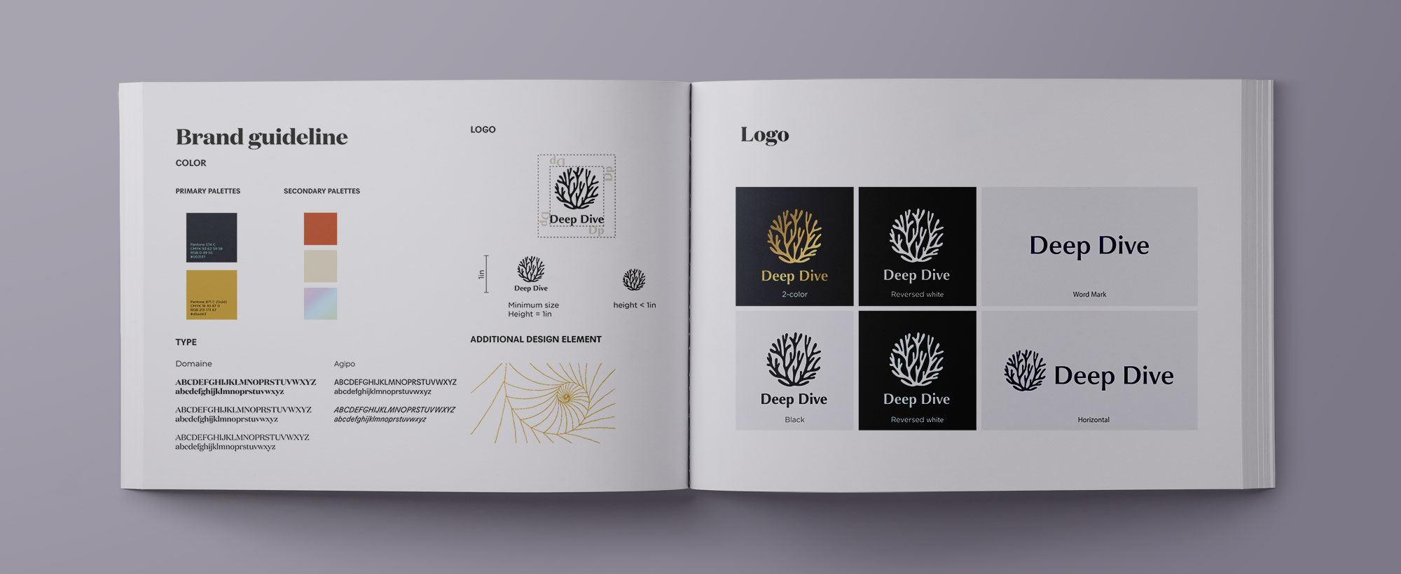
The Brand book
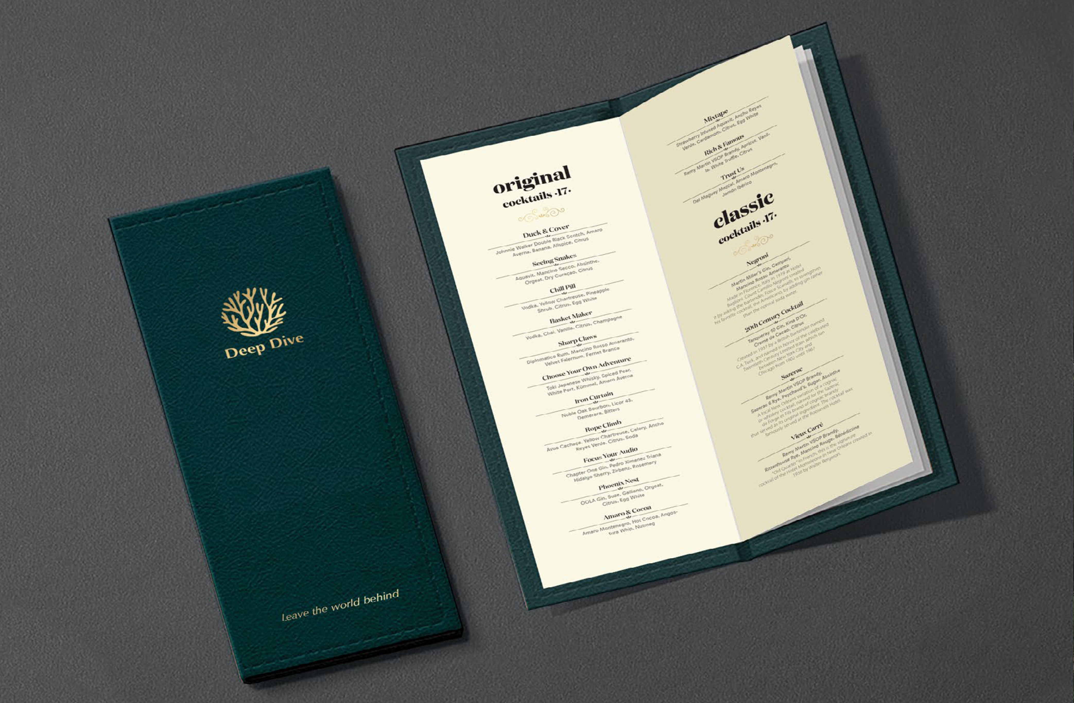
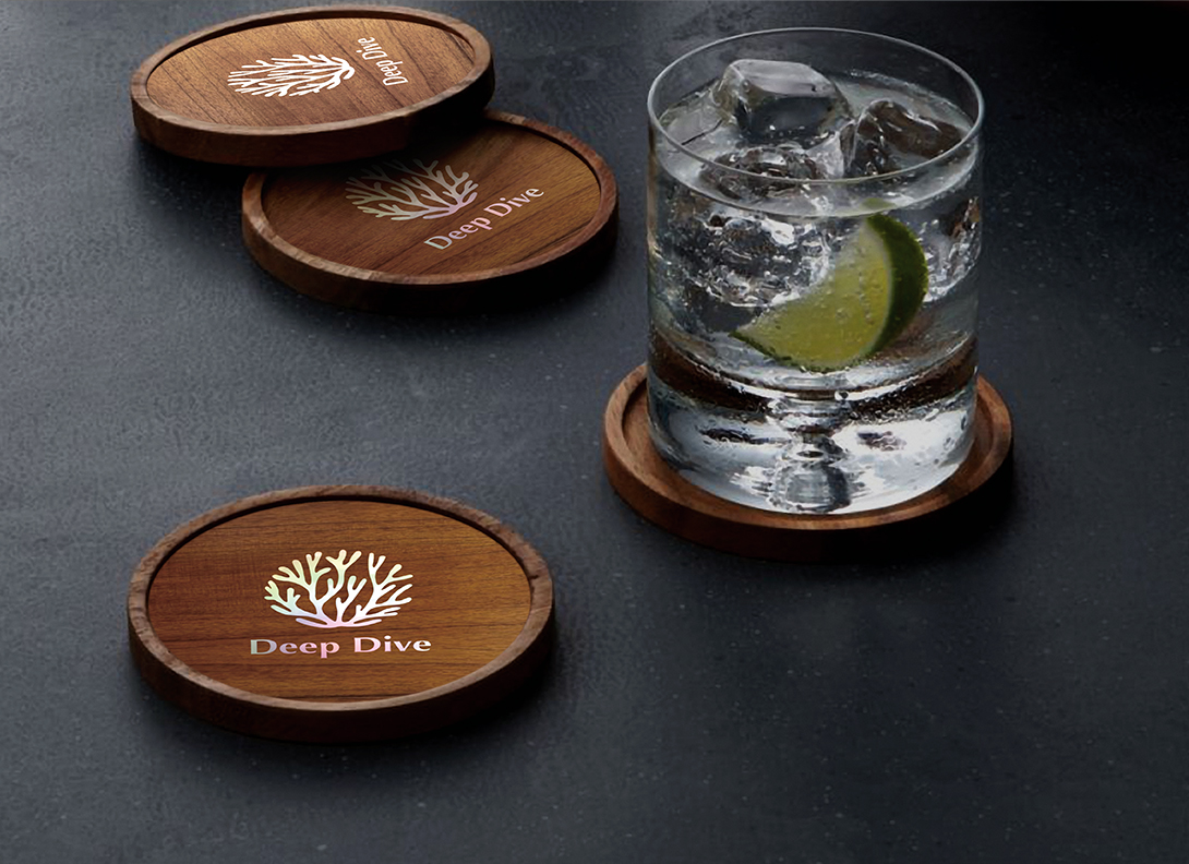
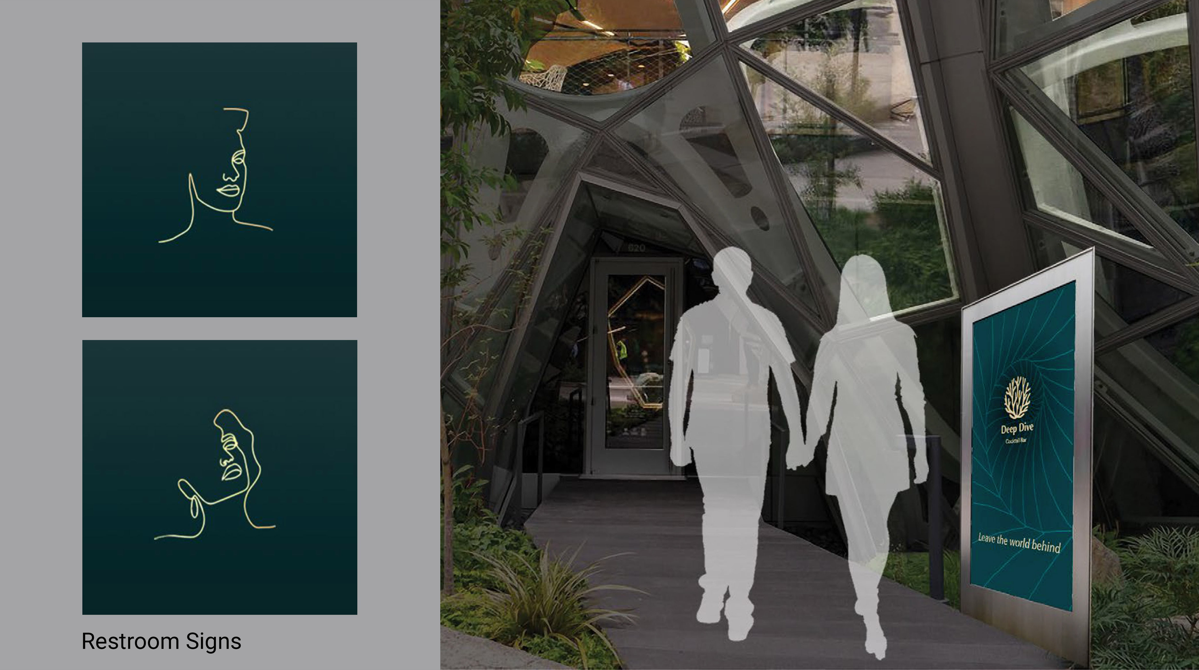
Brand in Action
Process
Research the brand
Renee Erickson’s restaurants have established a reputation by providing high quality service as well as artfully curated drinks and food. The interiors of her restaurants are thoughtfully creative and stray from the expected. The bar is fairly new so their reputation is not fully established.
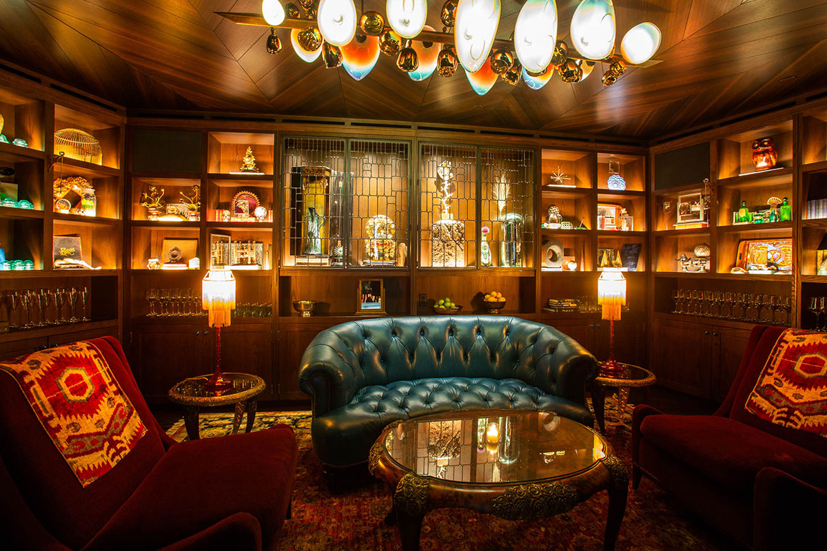
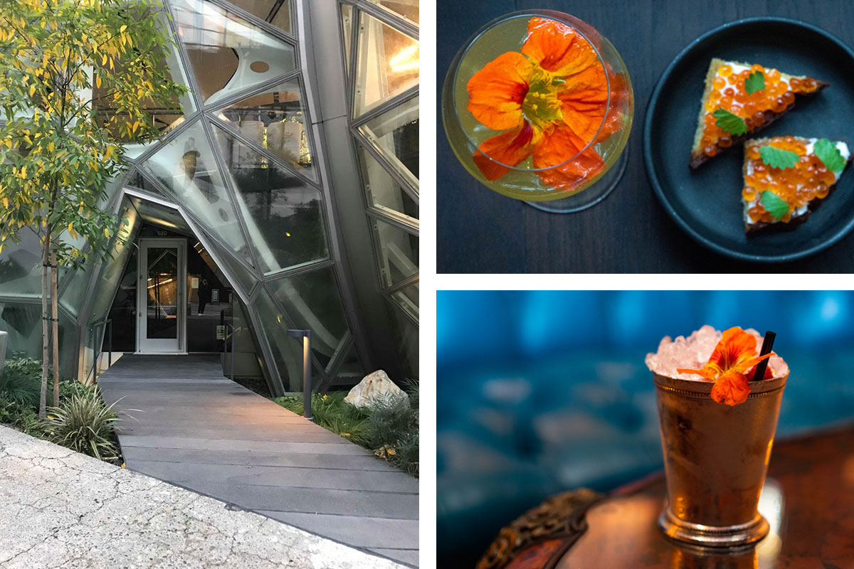
Defining character: Intriguing, Curated, Timeless
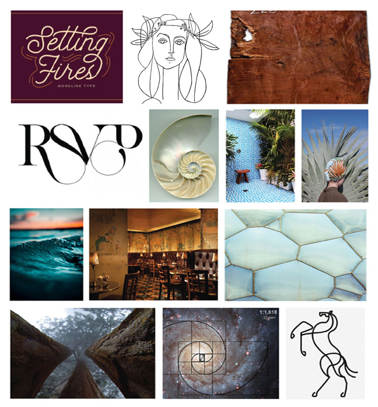
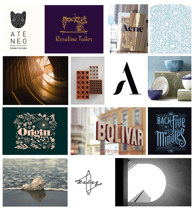
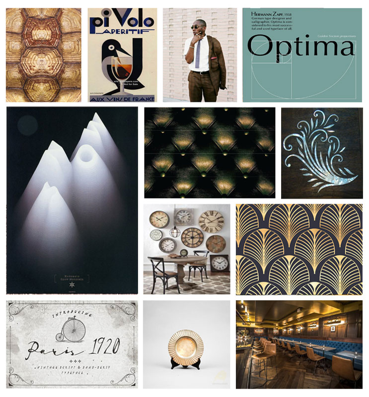
We started by visiting the bar, enjoying their cocktails, and interviewing waiters and some customers. And then, we did a number of both visually-driven and word-driven branding exercises to determine what the brand is, and what is not. We got the core of Deep Dive brand characters: intriguing, curated, and timeless.
Intriguing
Curated
Timeless
Concept
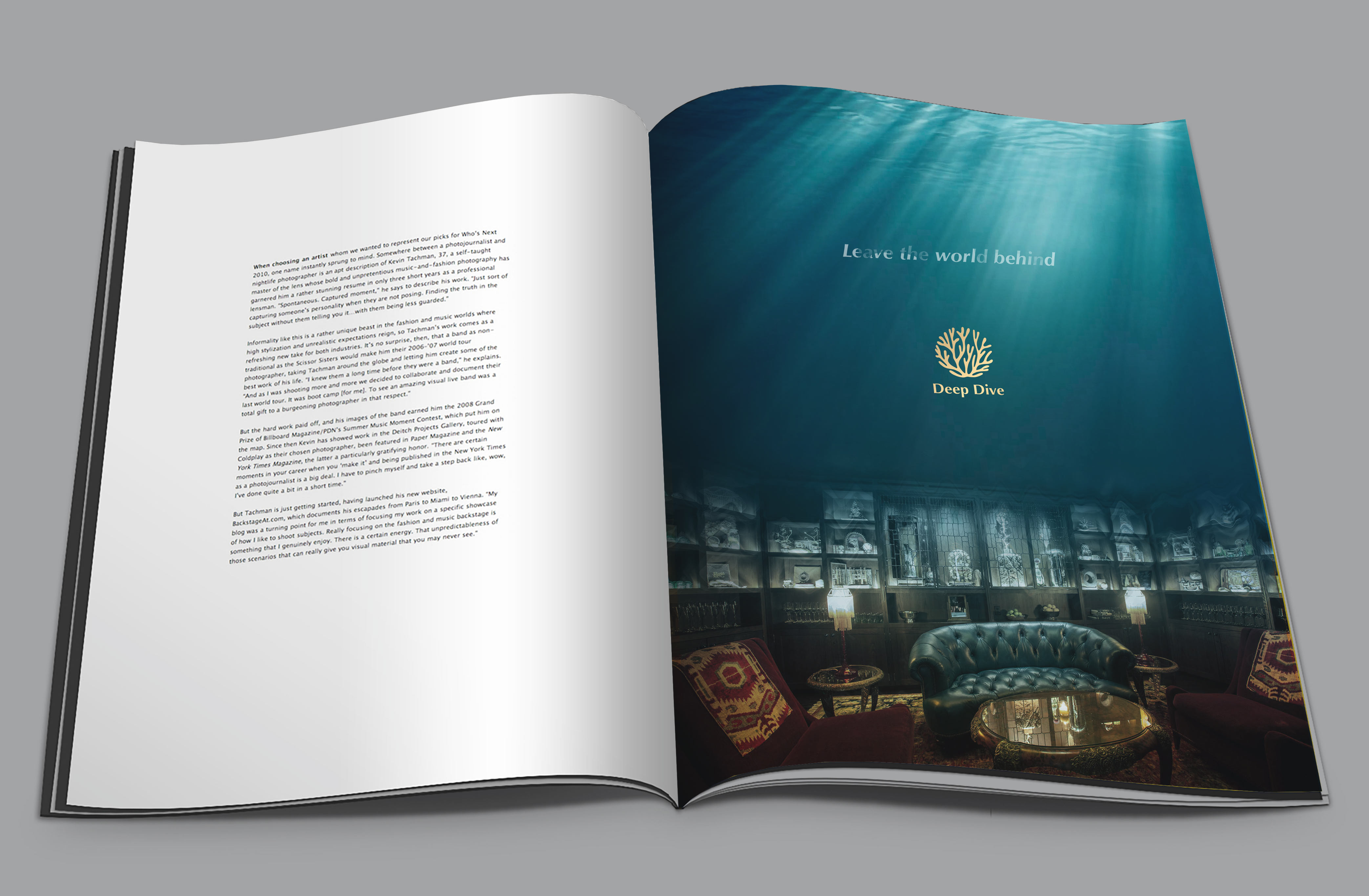
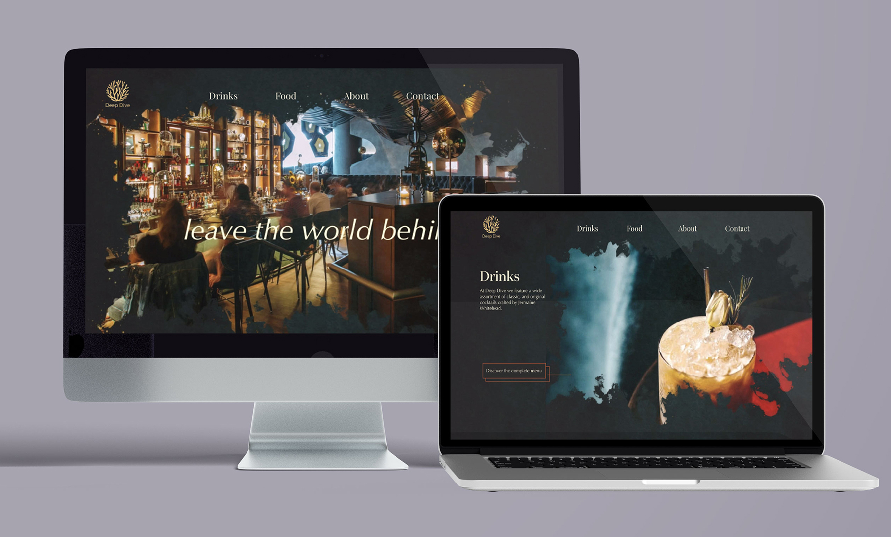
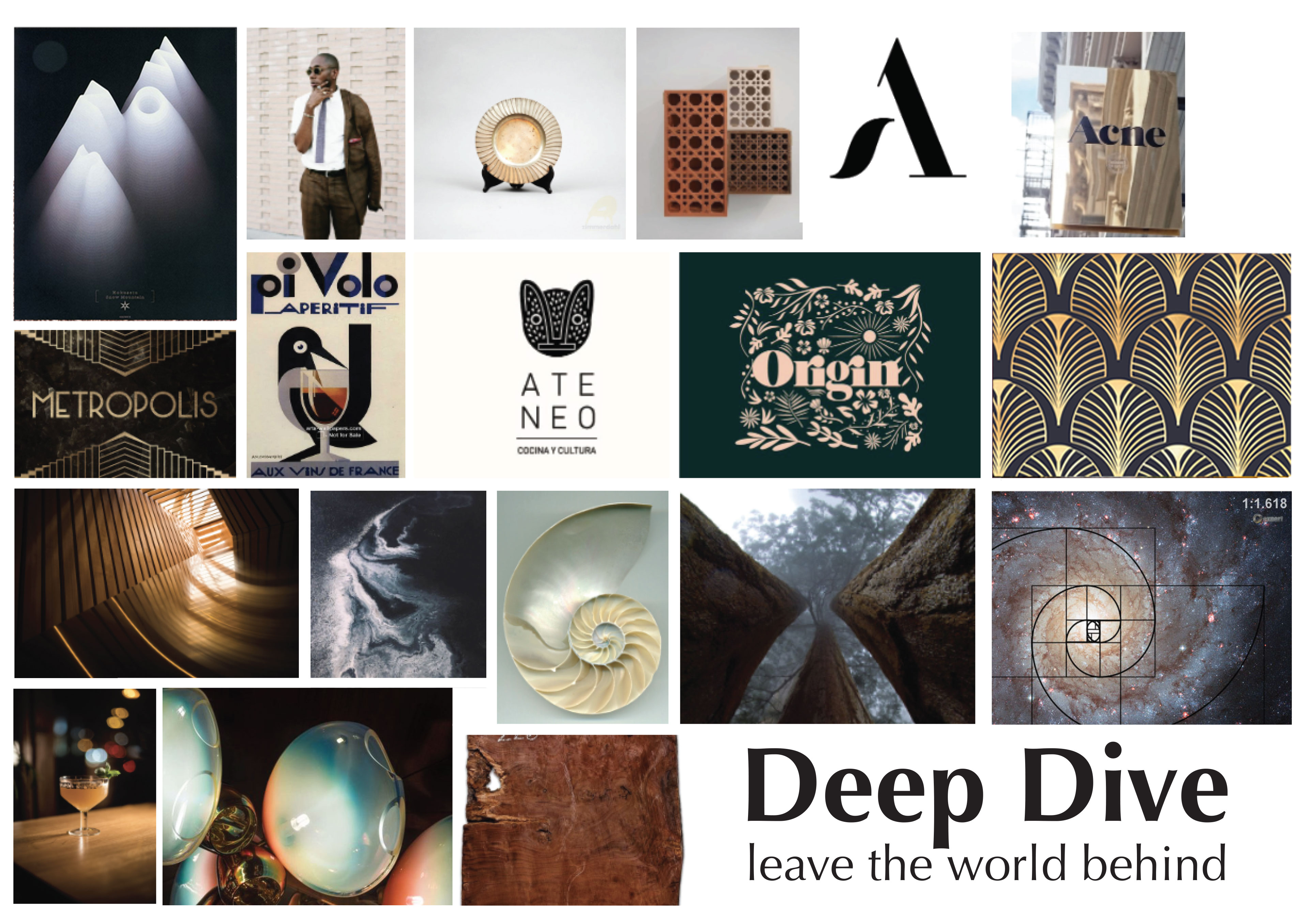
Once we had the character defined, we developed a series of graphic territories based around the characteristics we identified.The concept for our brand was gradually formed and become more and more clearly. After weeks of research and a number of visits to the bar, we both agreed that the most special thing of Deep Dive is to make the customers feel like entering a wonderful deep-sea world, where they can escape the real world, busy city, and work pressure. And thus, the concept of "Leave the world behind" was born.
Logo Design
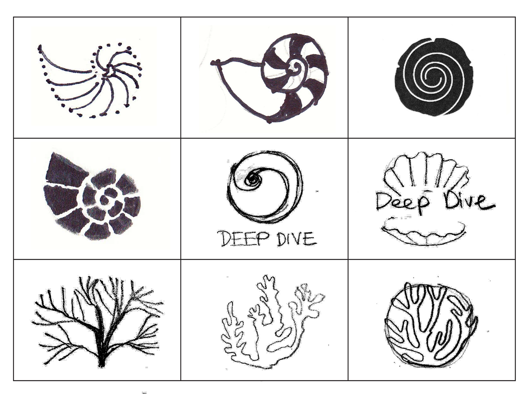
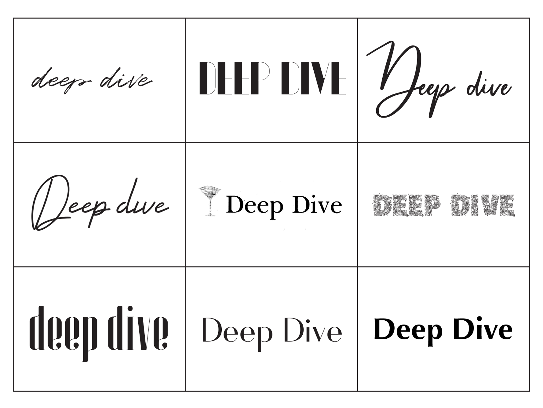
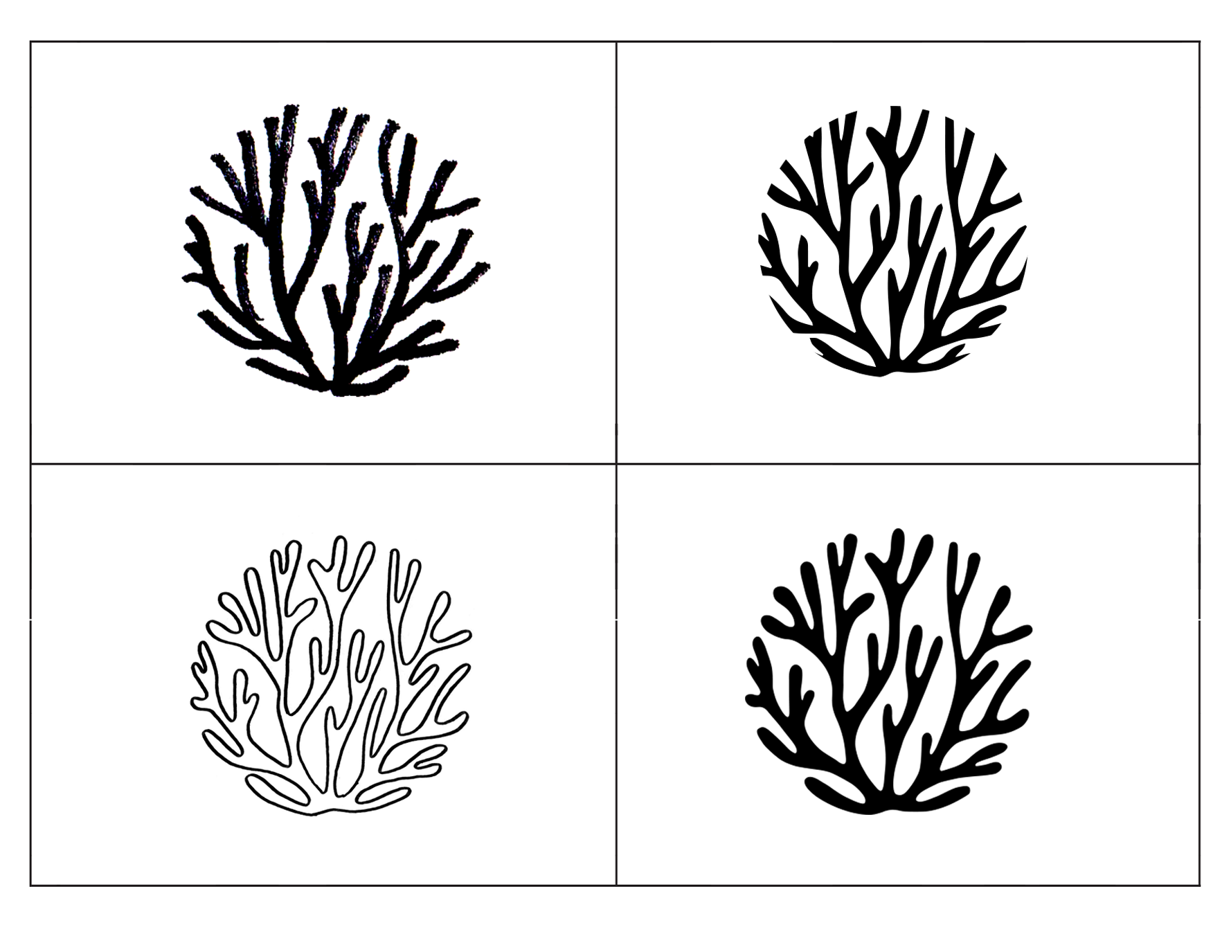
When creating the new brand mark, we have worked through many sketches and typeface to create a mark that balanced organic attractiveness and curated elegance. Inspired by charming and curious creatures on the seabed, logomark was created by a natural coral shape that is limited by a intentional circle. A classic san-serif typeface (Optima) is placed right at the focal point of the coral to make the eye-catching logo.
