The Symbols Magazine
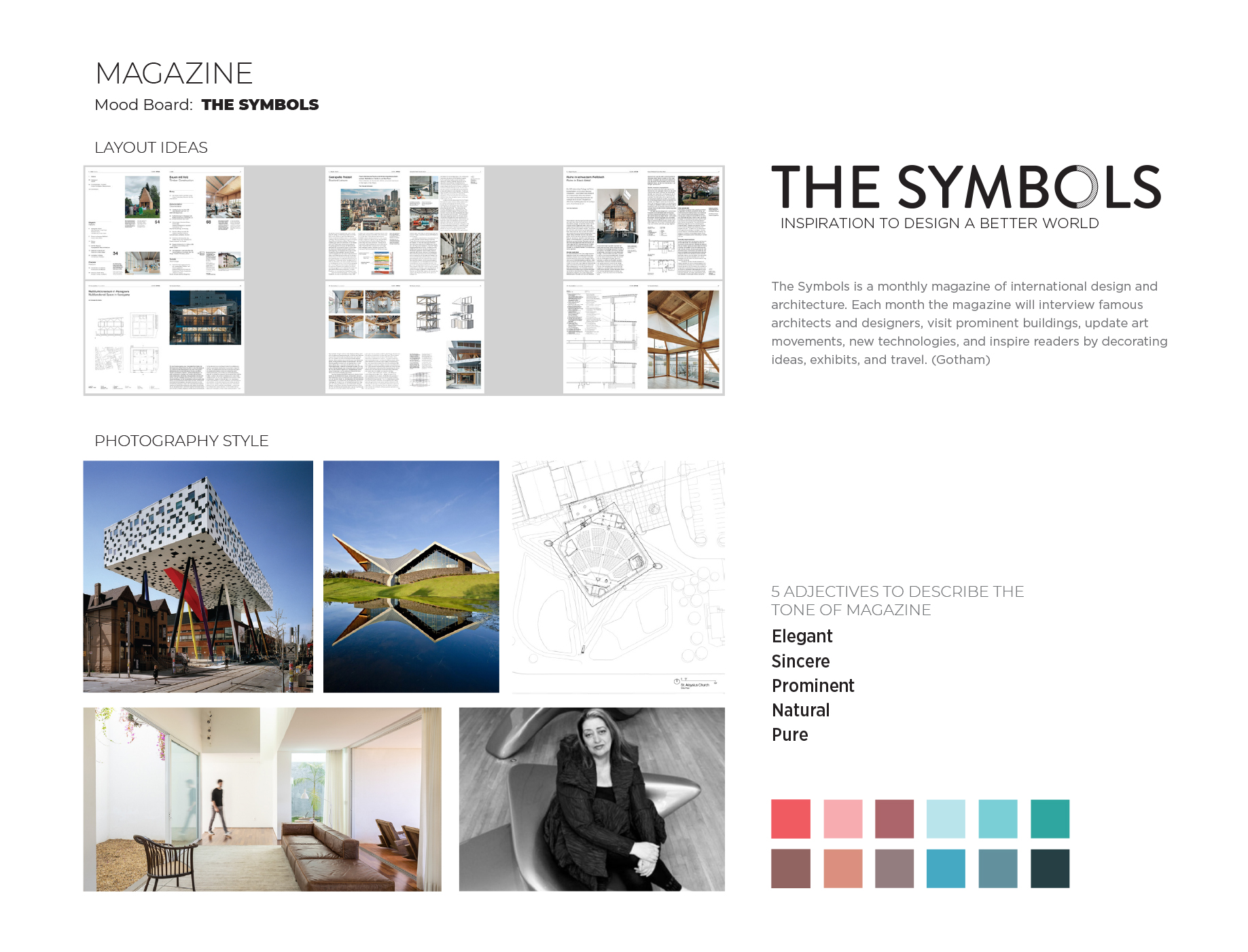
The Symbols is a monthly magazine of international design and architecture. Each month the magazine will interview famous architects and designers, visit prominent buildings, review art movements, new technologies, and inspire readers with decorating ideas, exhibits, and travel.
- Timeframe: 11 weeks
- Roles: Typography, Layout & Art Direction
- Skills: InDesign, Photoshop
Challenge
As the architecture world continues to develop, new technologies, many environmentally friendly solutions, and new concepts are applied in architecture. Challenges include how to provide inspiration, tools and knowledge for designers and architects by introducing good examples, updating new architecture projects and products.
Project Goals
build a place where architects, designers and building professionals can find good examples of contemporary architectural and design projects. The content can be used on inspiration and education for creatives.
Solution
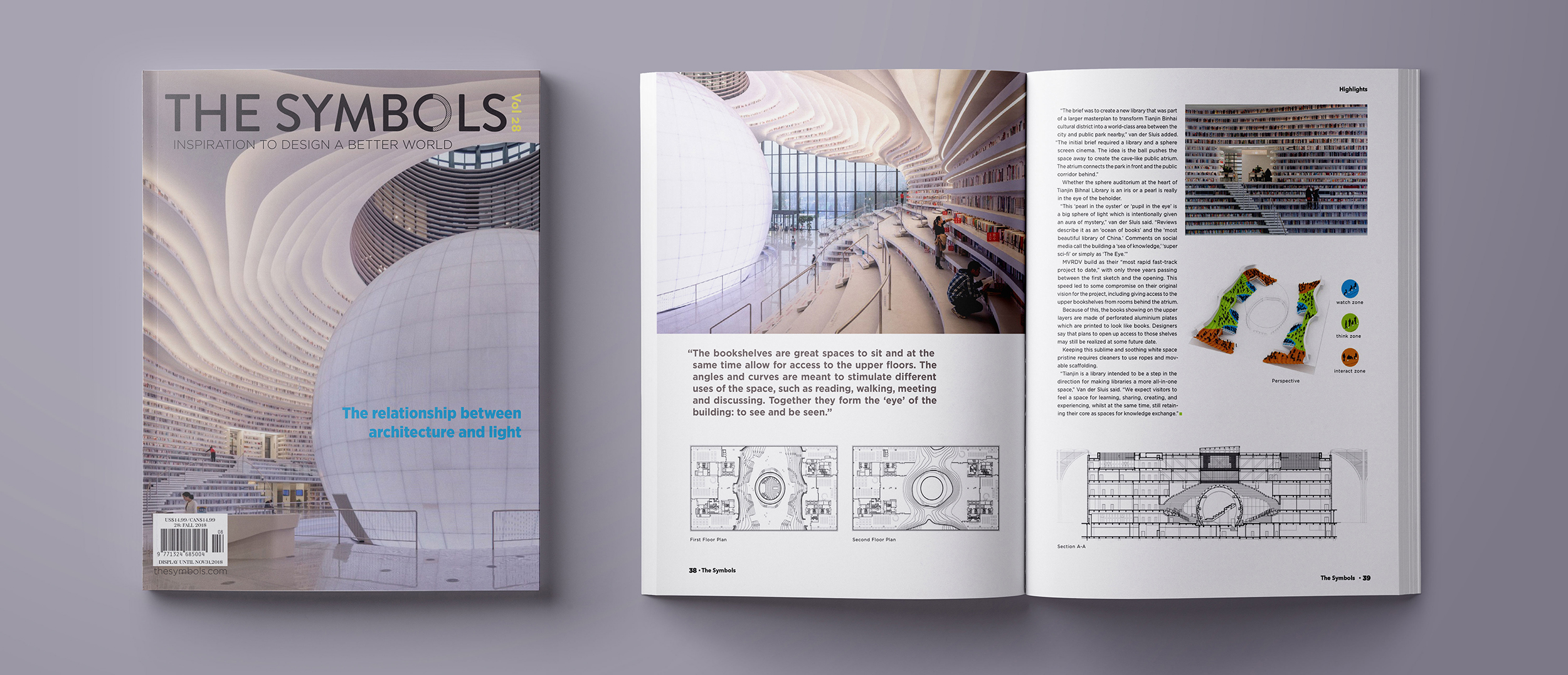
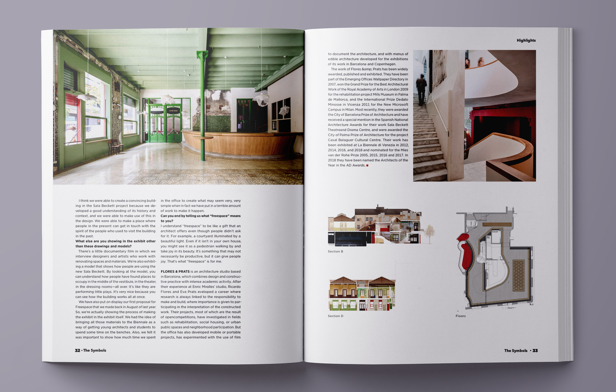
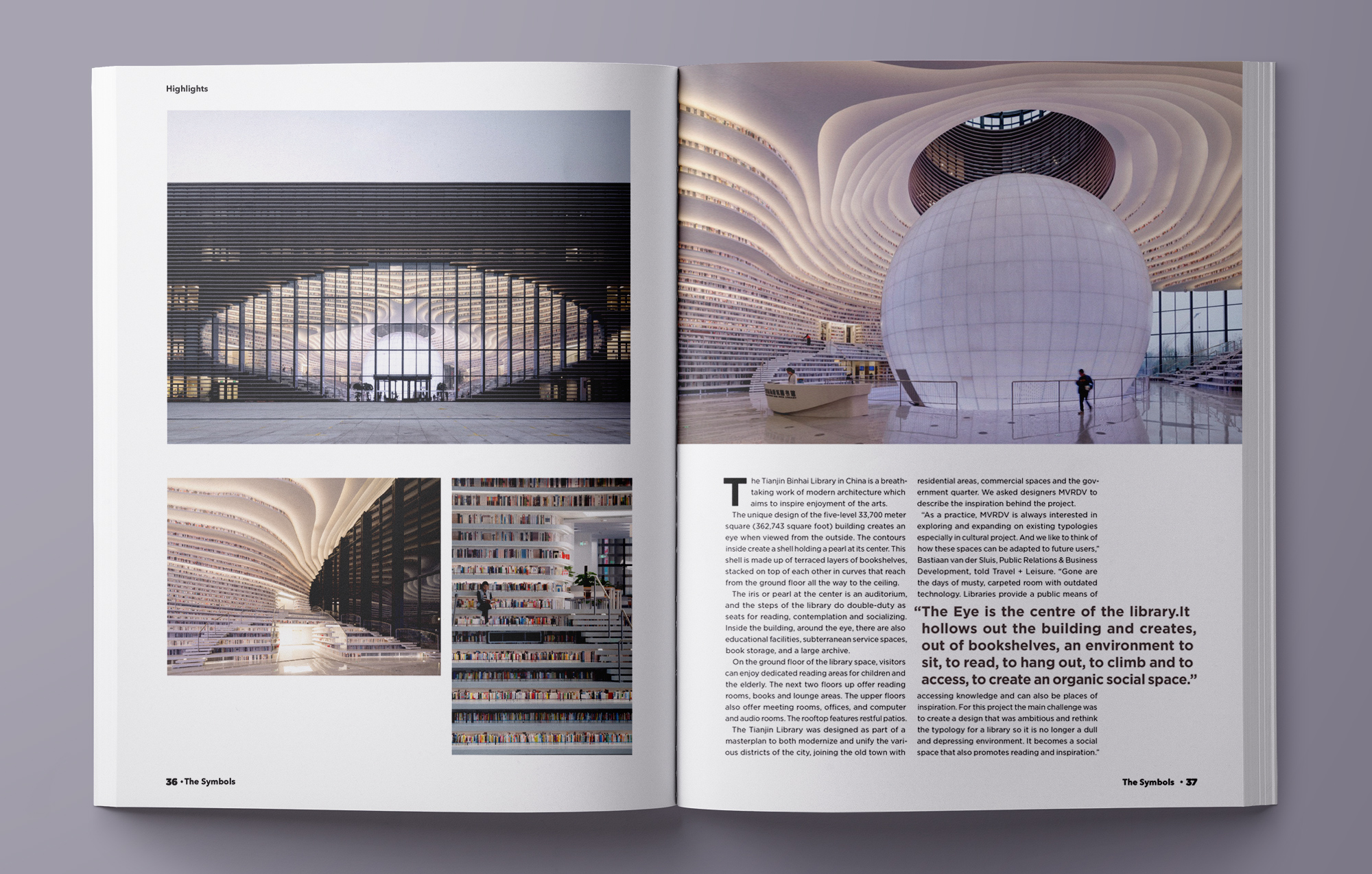
A 60-page magazine with carefully curated content and digestible layouts to showcase outstanding modern architectures by providing deep database of projects, news, tools, images, drawings and products.
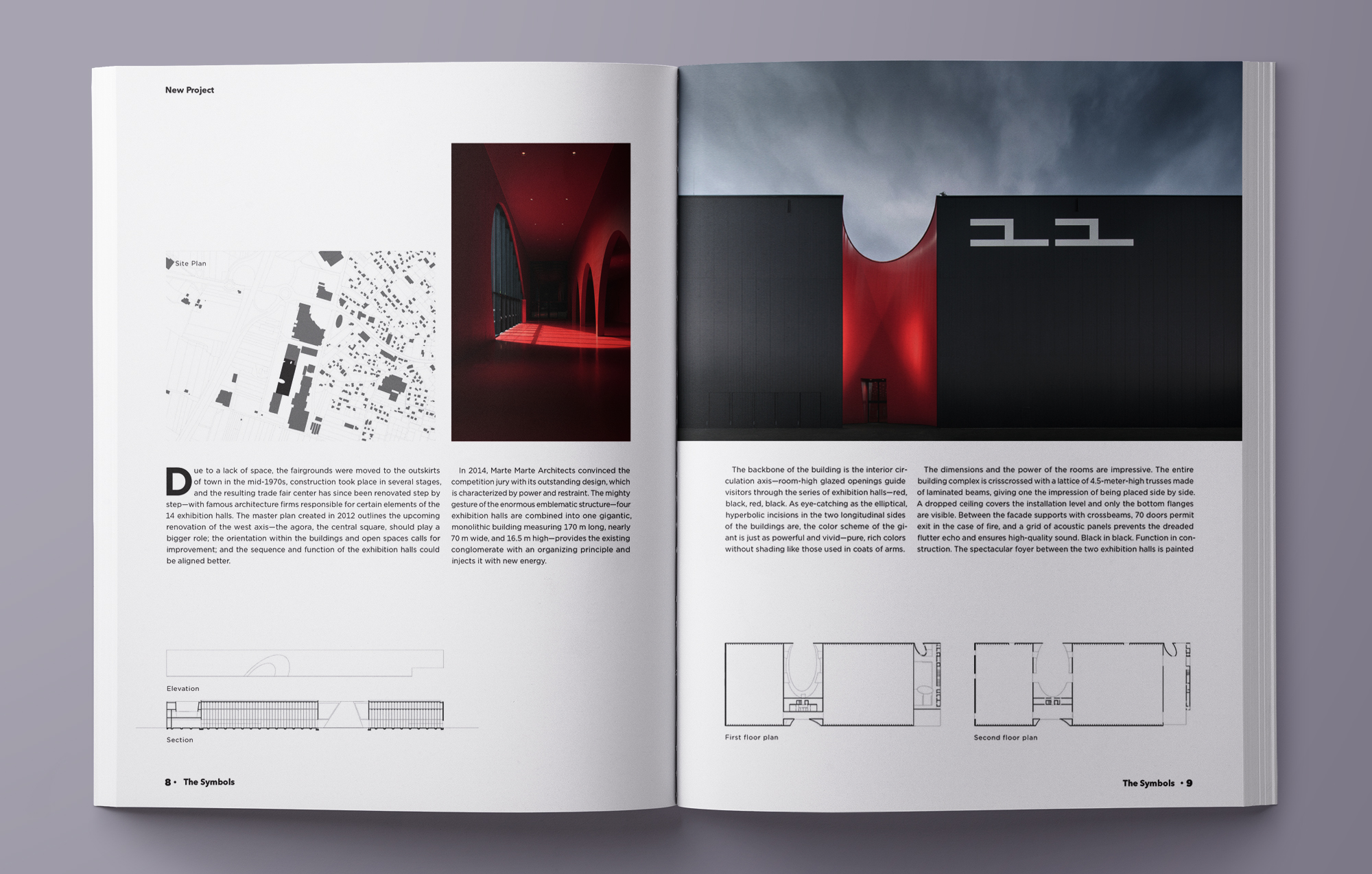
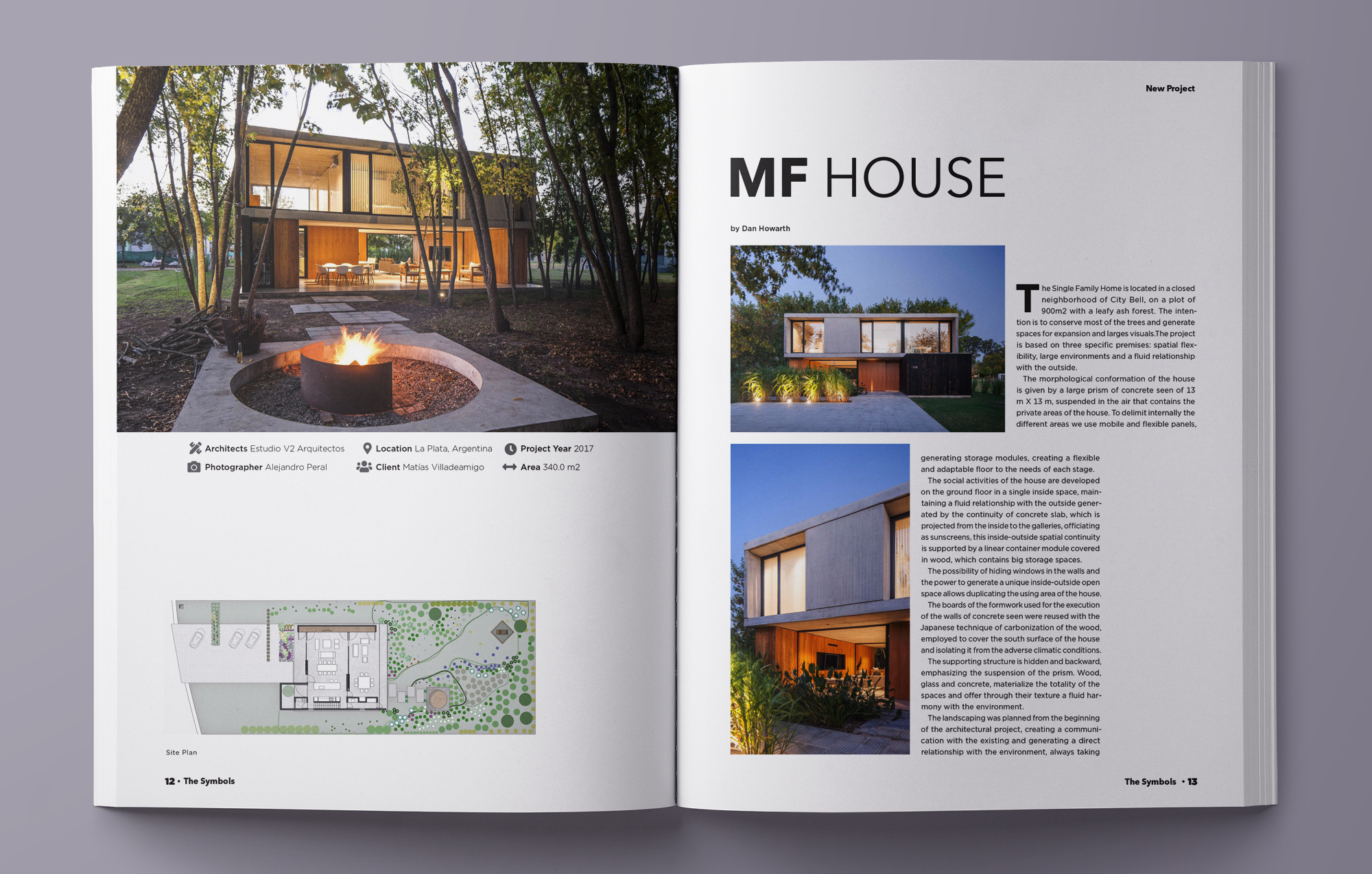
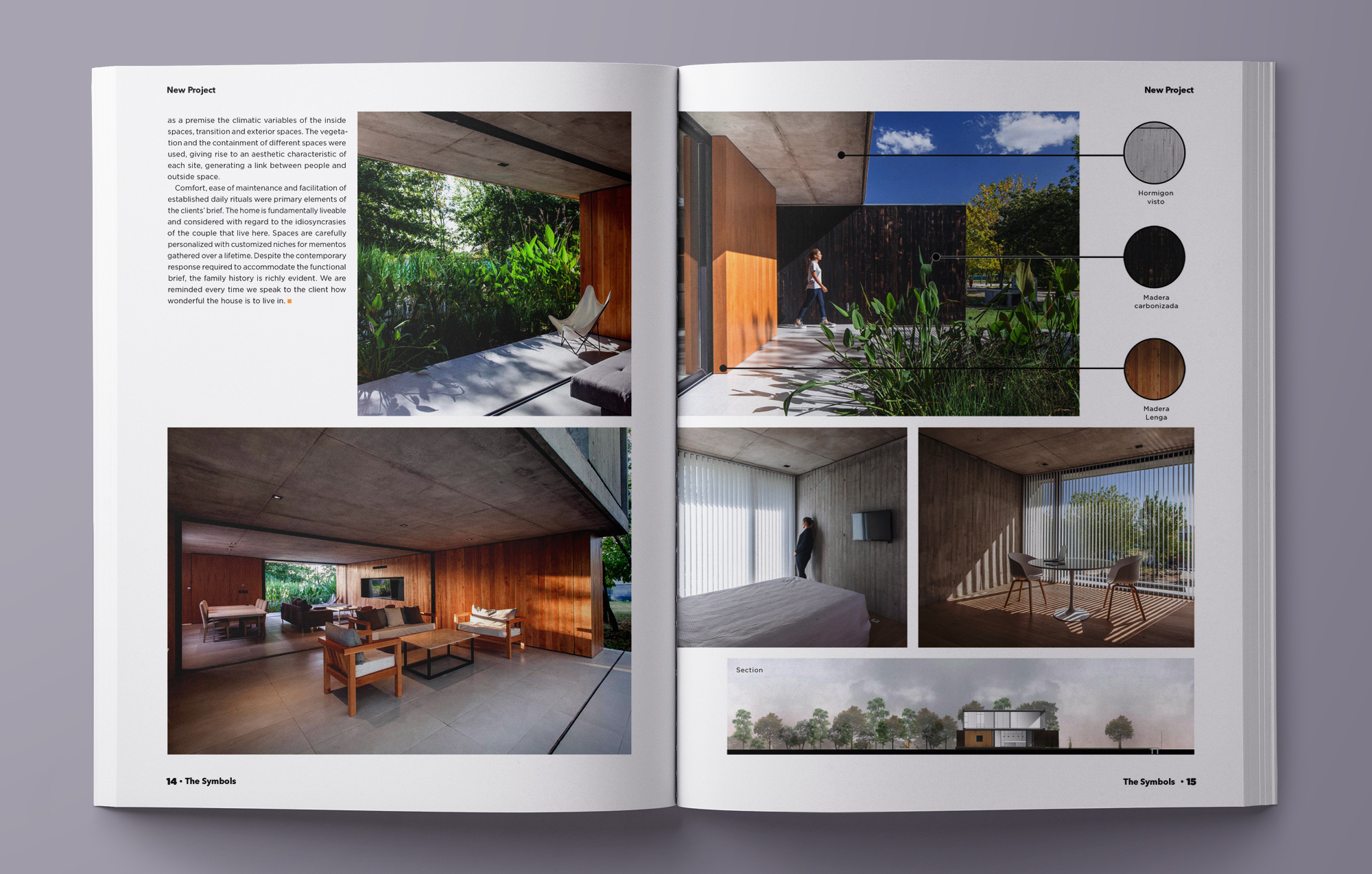
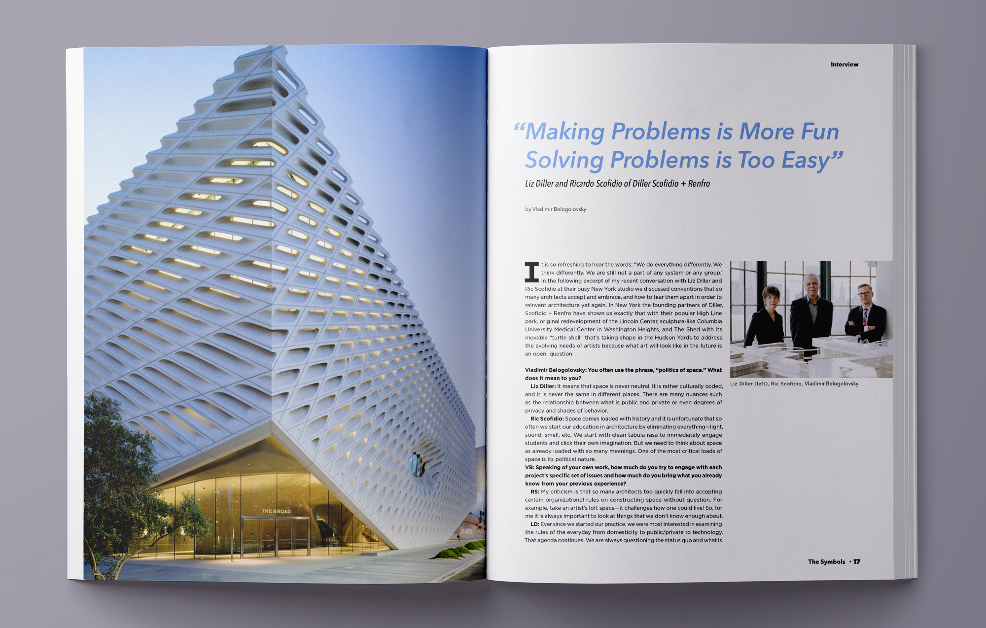
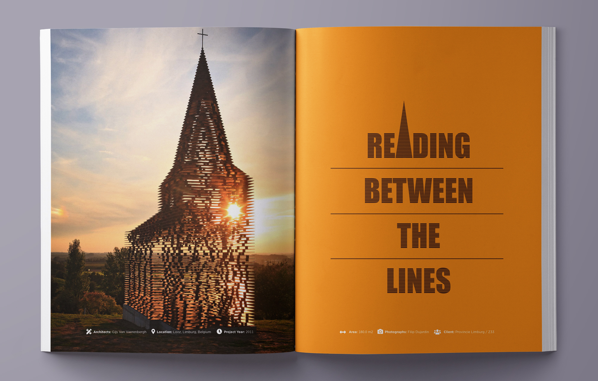
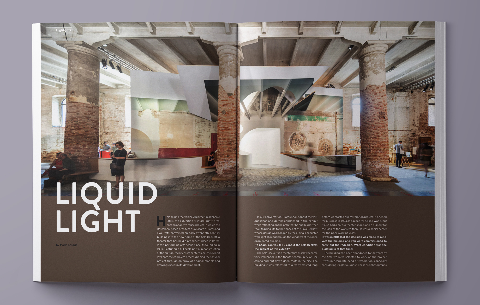
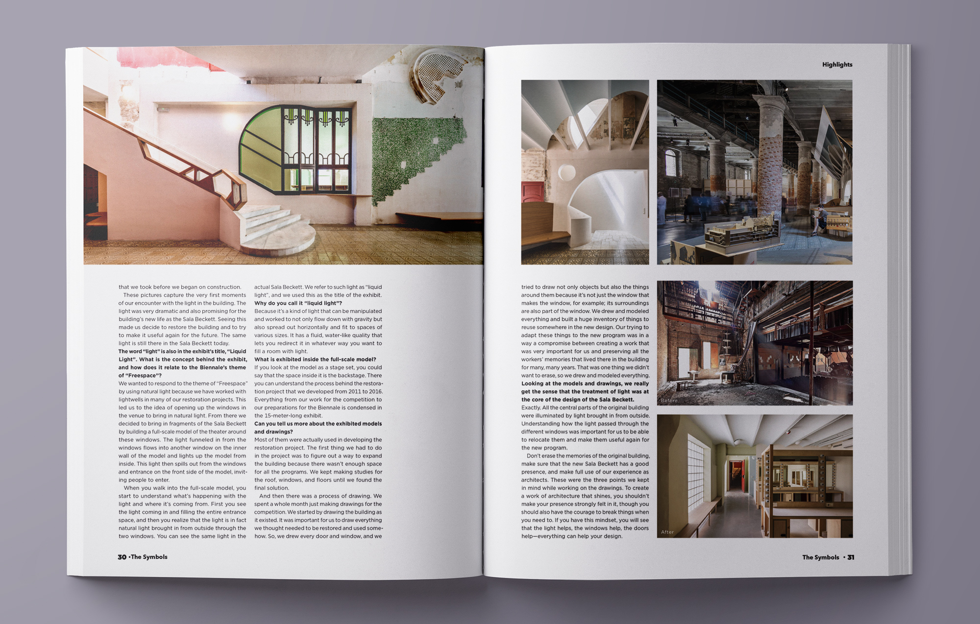
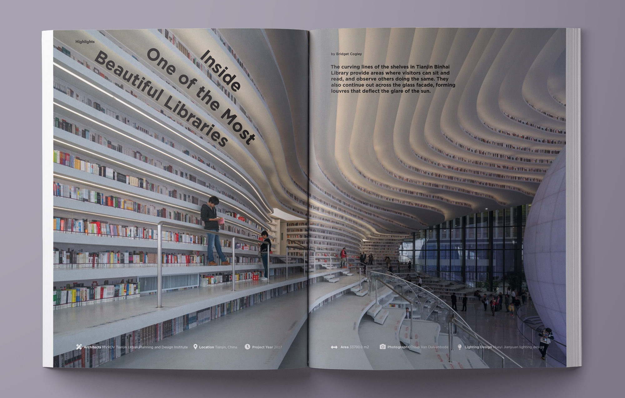
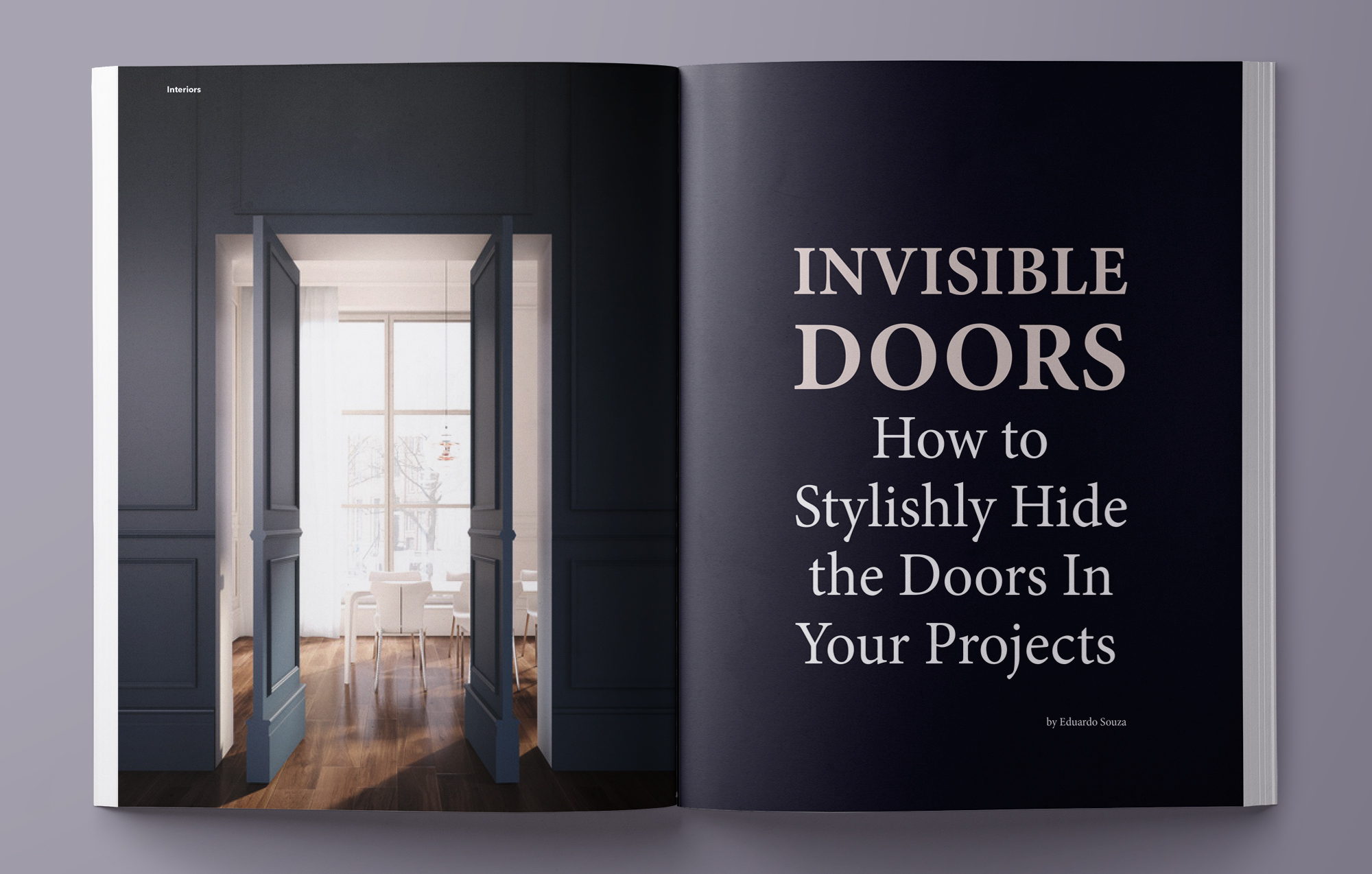
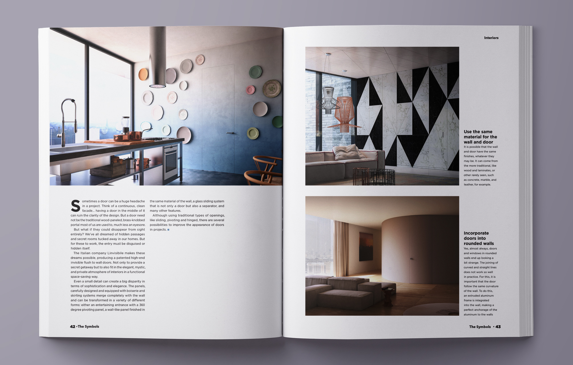
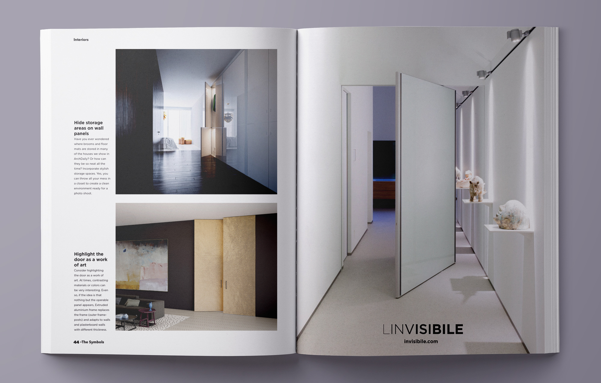
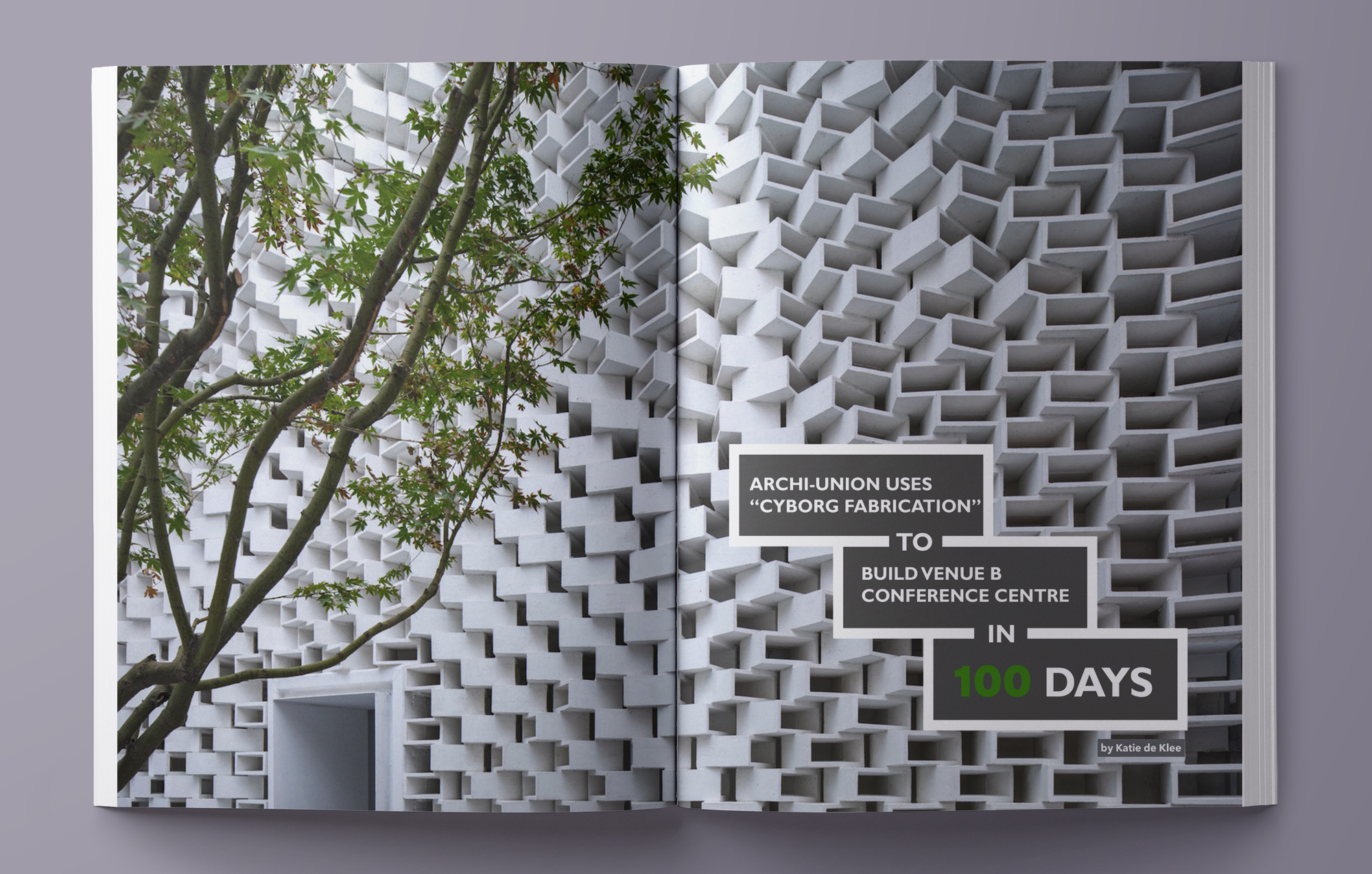
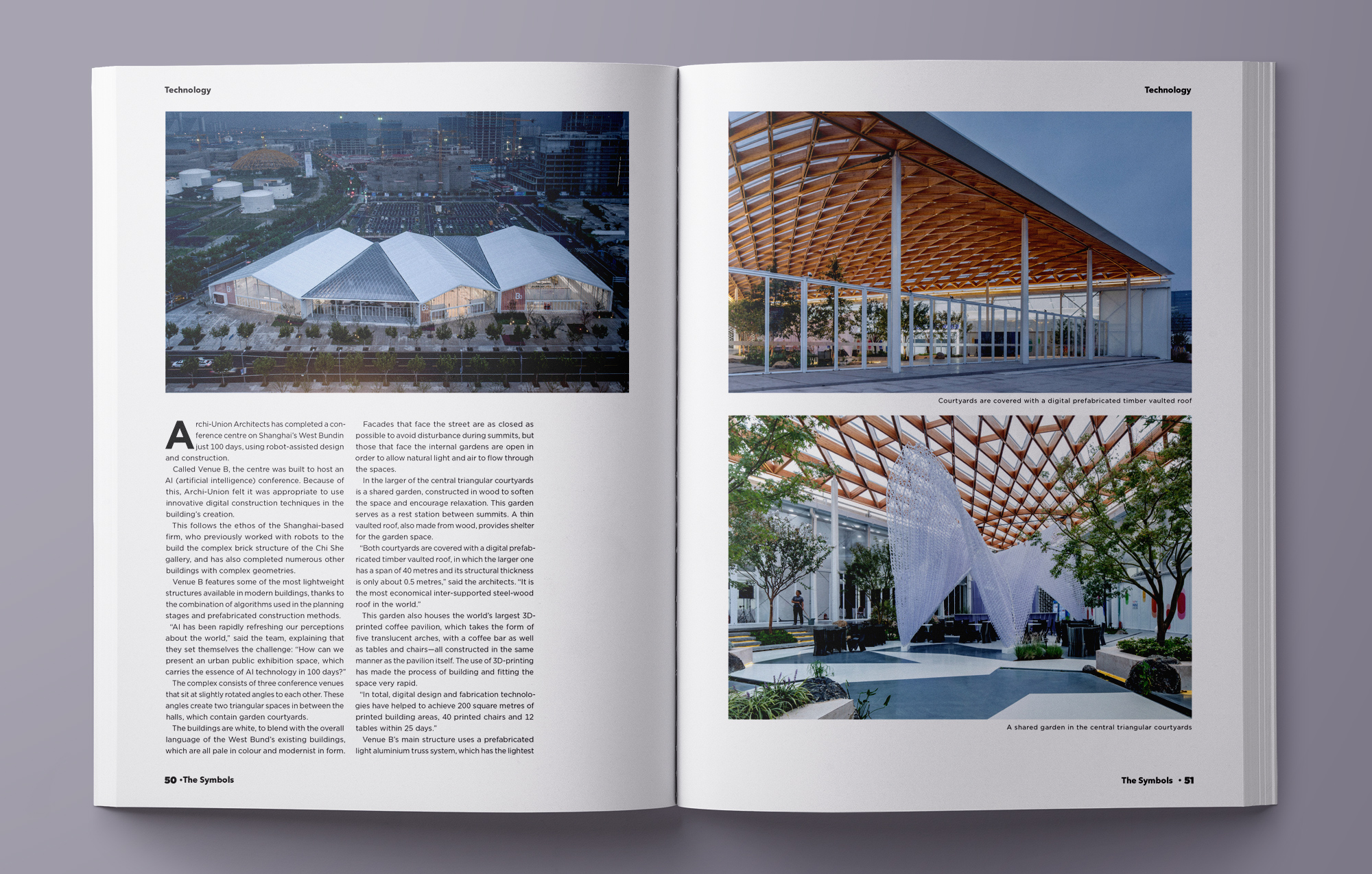
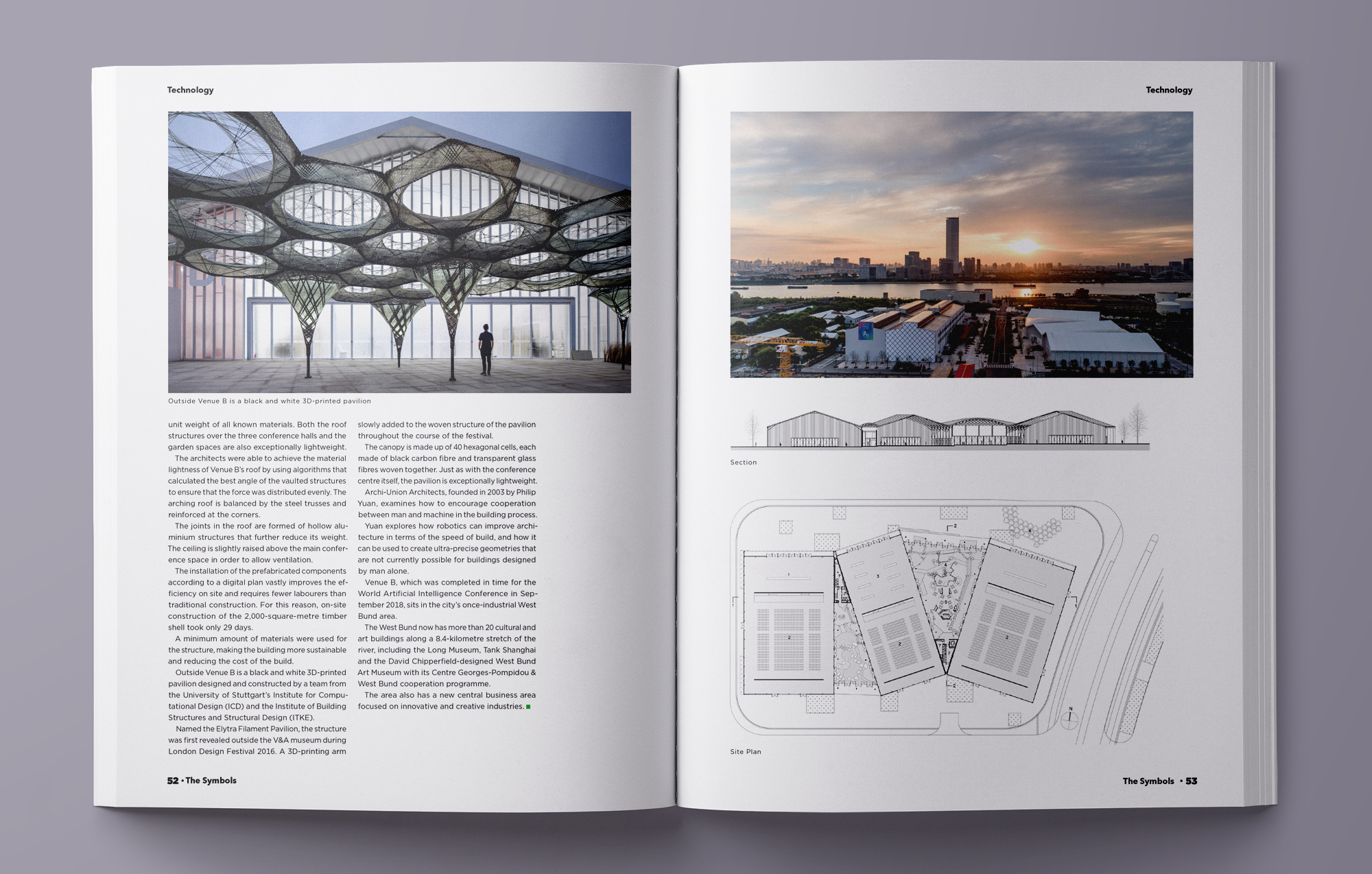
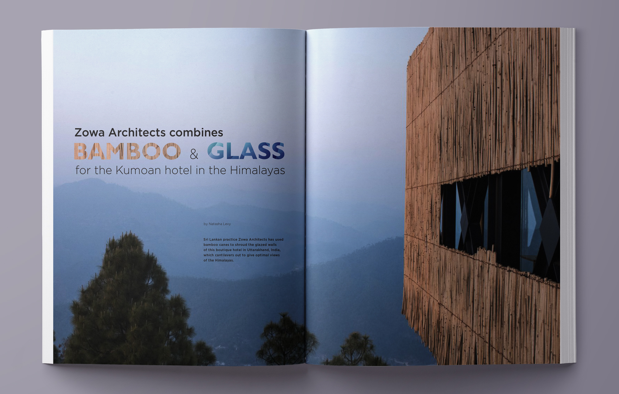
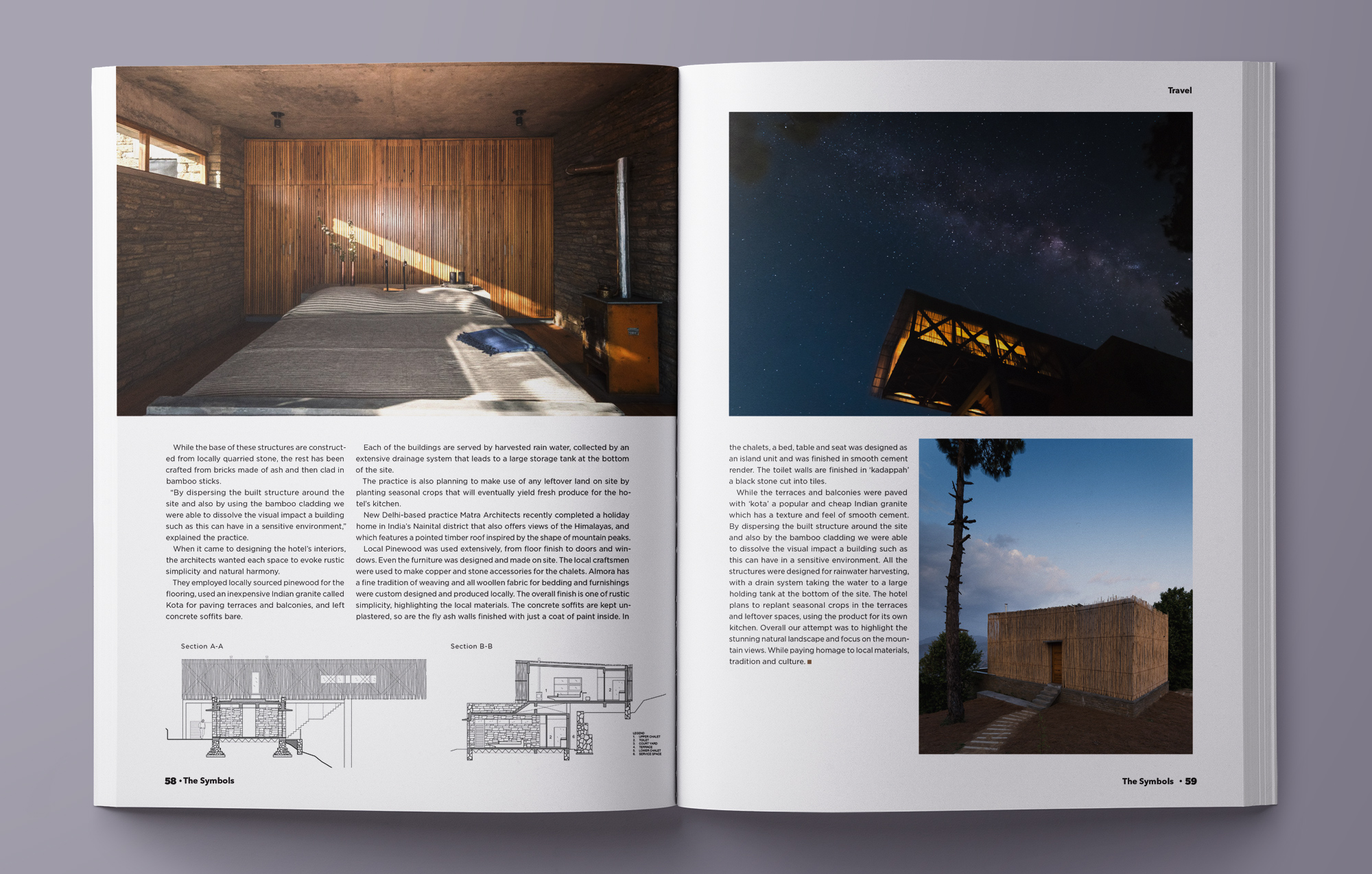
The opening spread of each article makes an impression by using the big, full page images and responsive titles. I use a simple, clean, and asymmetrical layout to honor the beauty of the architectures. Colors are pulled from images to create natural feeling and consistency for the articles.
The Inside




The Process
Researching the market
Current architecture magazines integrate various aspects of architecture. These magazines not only feature what transpired in the built environment, highlight the icons in the architecture industry or their famous clients, but provide in-depth knowledge about the current culture and also give reasons why architects make certain decisions.
Competitors
Dwell magazine focuses on both function, and comfort, as people show off their own homes and discuss design elements of all kinds.
Architectural Digest covers topics like interior design, celebrity style, and travel, while also recommending shopping sources and other info.
Architectural Record offers a unique array of news topics and combines the business and art sides of architecture for those interested in design.
Identifying the readers
Three reader personas were developed to reflect the diversity of knowledge and aesthetic perspective in architecture: architects (professional), design students (entrant), construction engineers (technical). Most of them are working in the field of architecture. They subscribe to magazines to have an inspiration, knowledge and tools for their design work.
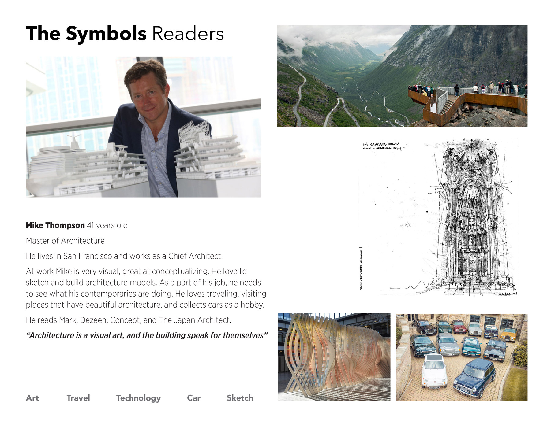
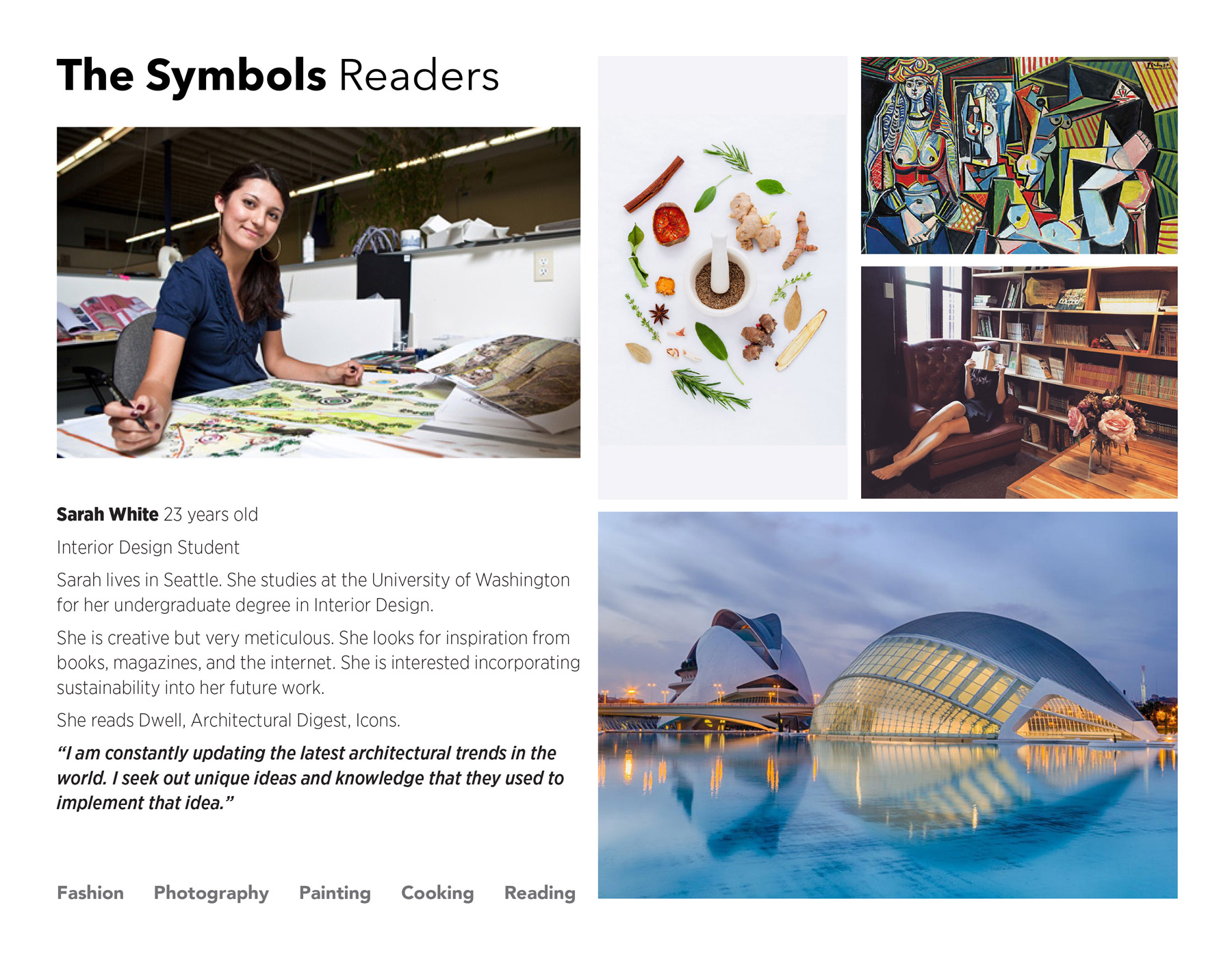
Curating the content
Aiming to serve a professional design audience, the magazine’s content was carefully curated. As shown in the table of contents, each issue covers different aspects of architecture such as structure, lighting, technology, materials, sustainable architecture, and so on. This issue focus on lighting in the architecture, with the new project and interviews covered early on, highlight content featured in the middle, and expanded content (technology and travel) at the end.
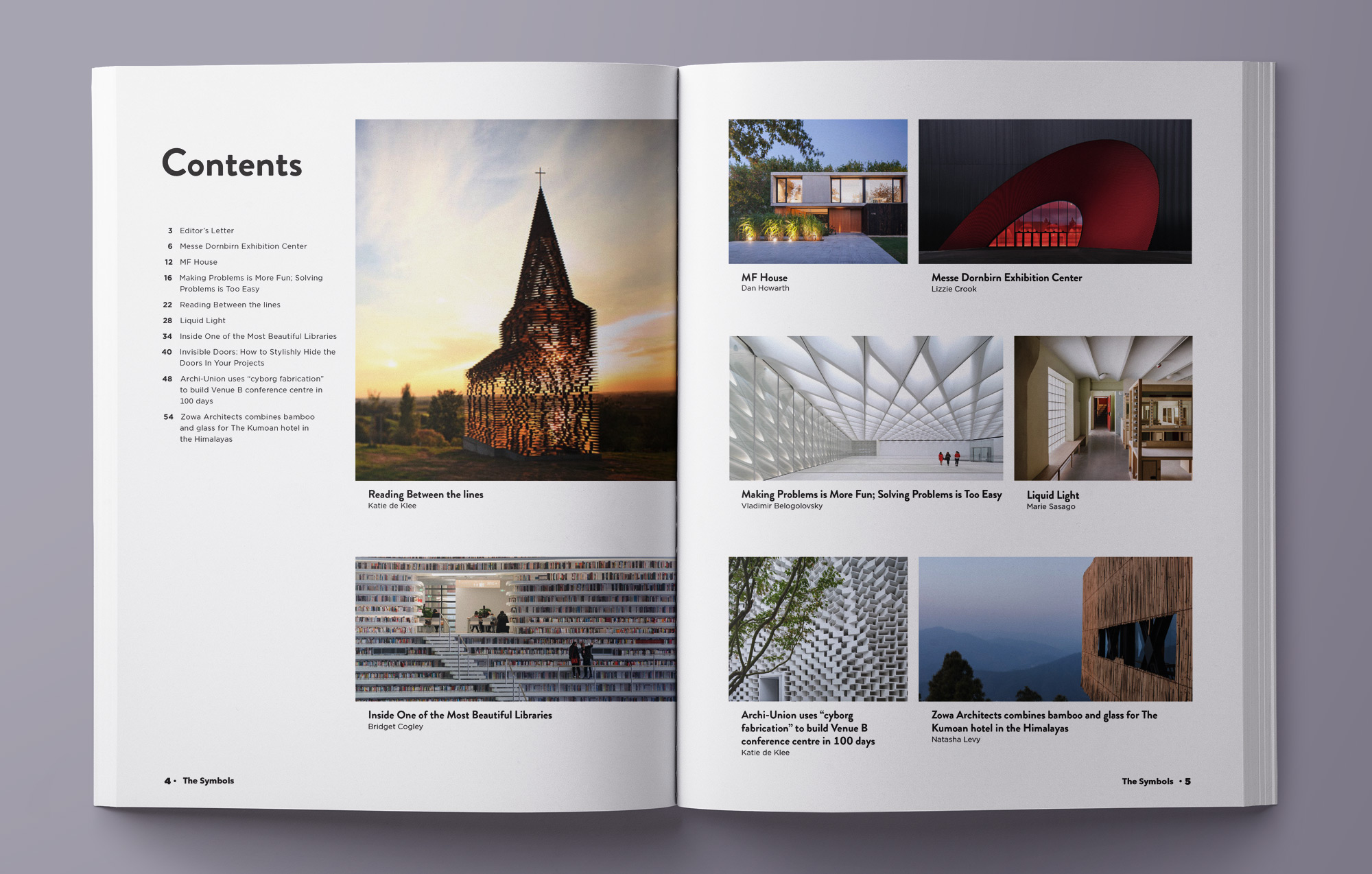
Establishing the visual direction
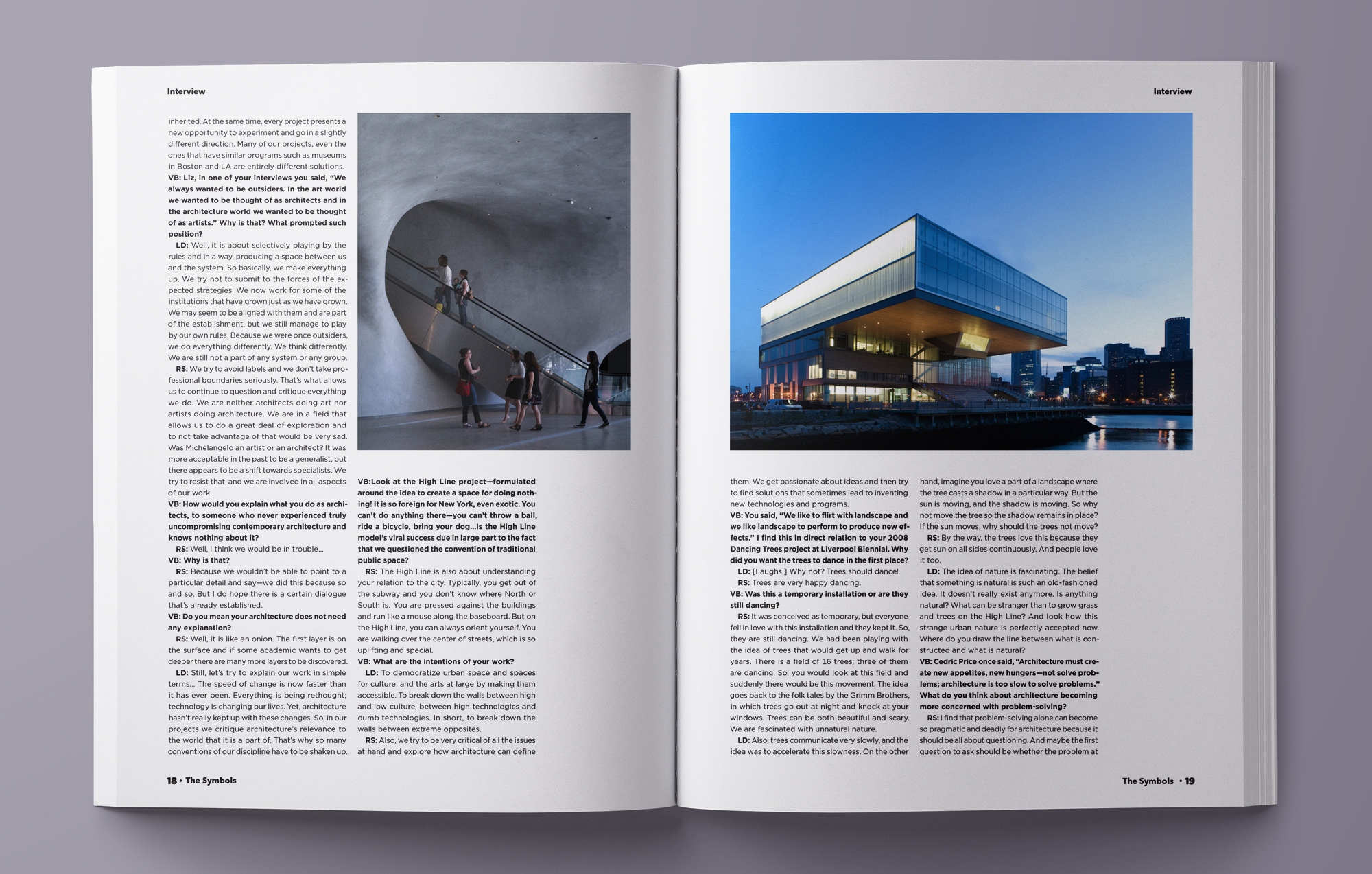
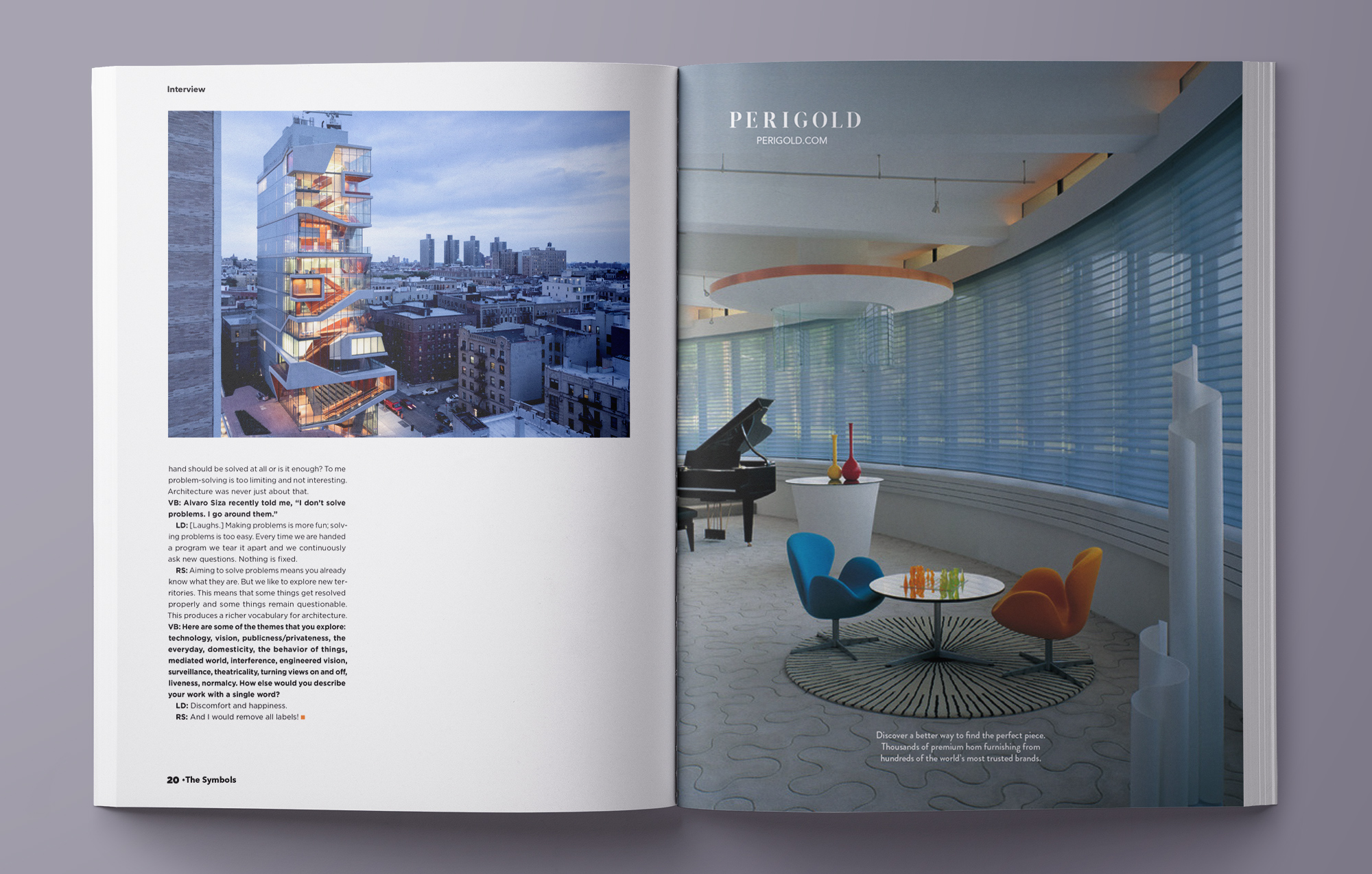
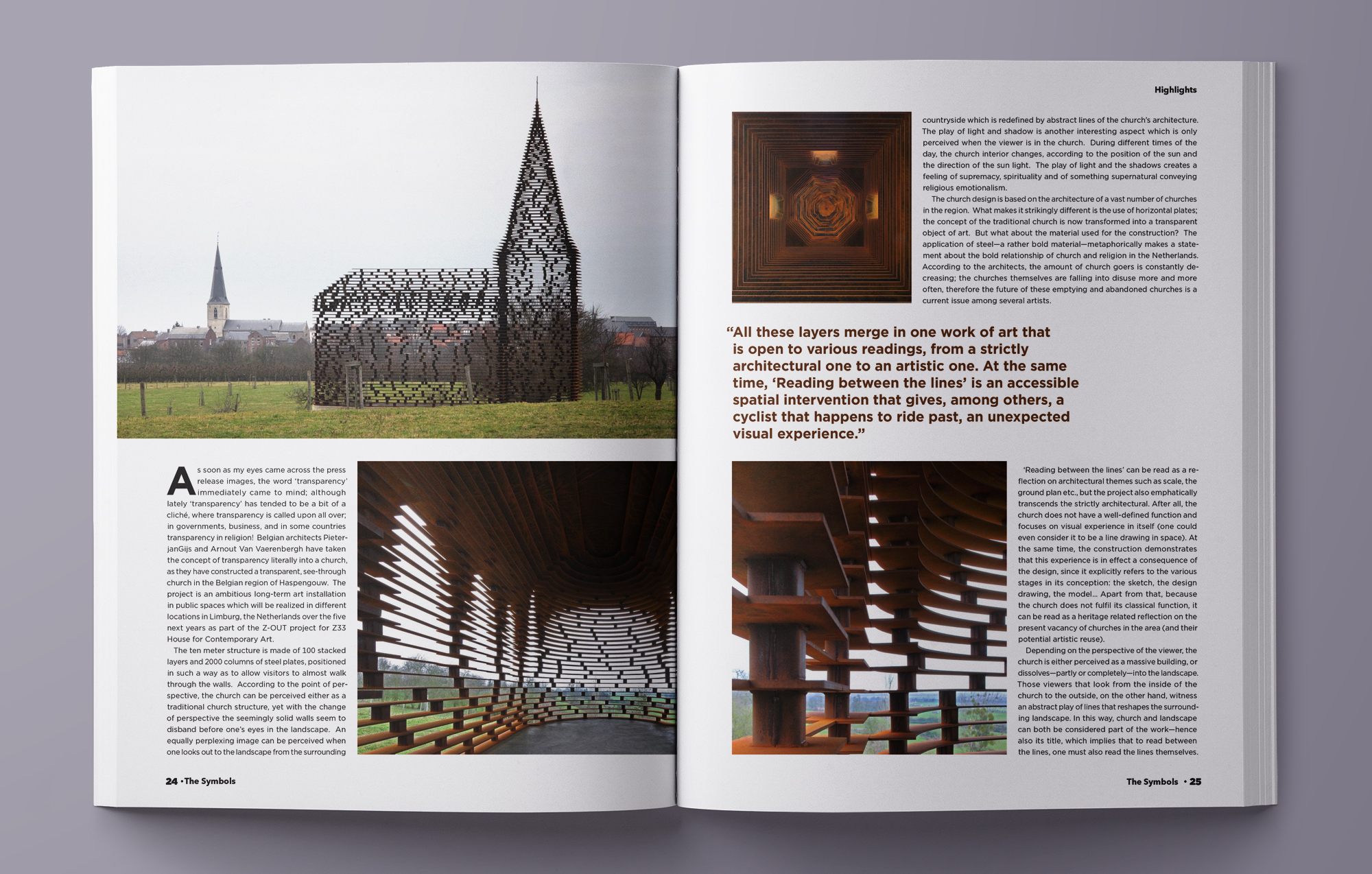
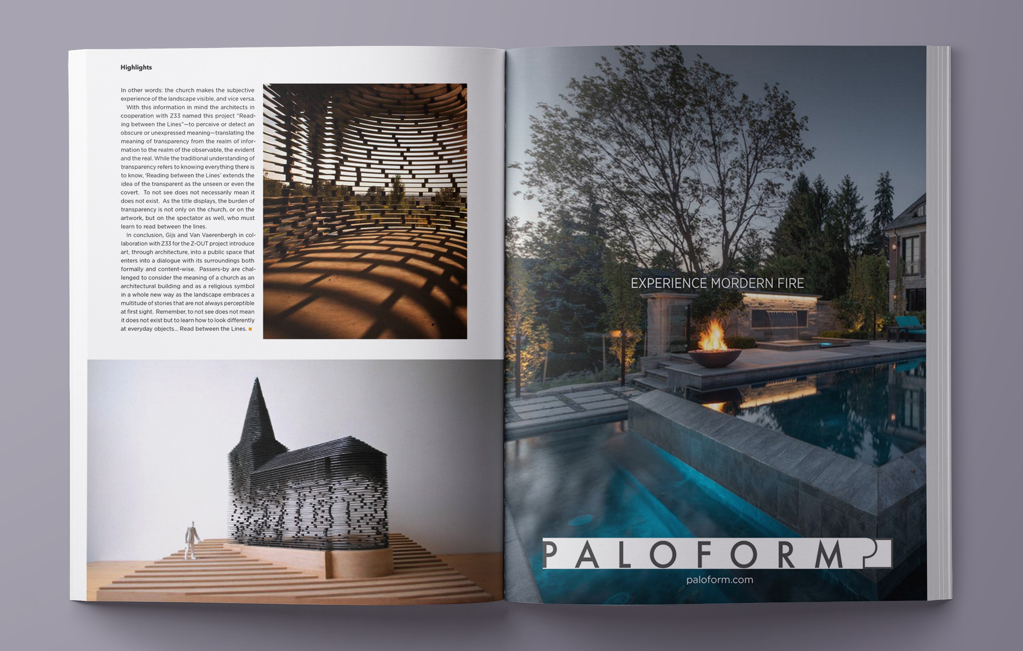
Stylistically, the magazine’s goal is to use a simple layout, stunning images, and clear drawings to honor the architecture featured. The Symbols is elegant, sincere, prominent, and natural. The articles have an impressive opening spread with full images and responsive title. I used simple geometric sans serif typefaces (Gotham), natural color from images, beautiful architectural photos throughout the magazine.
