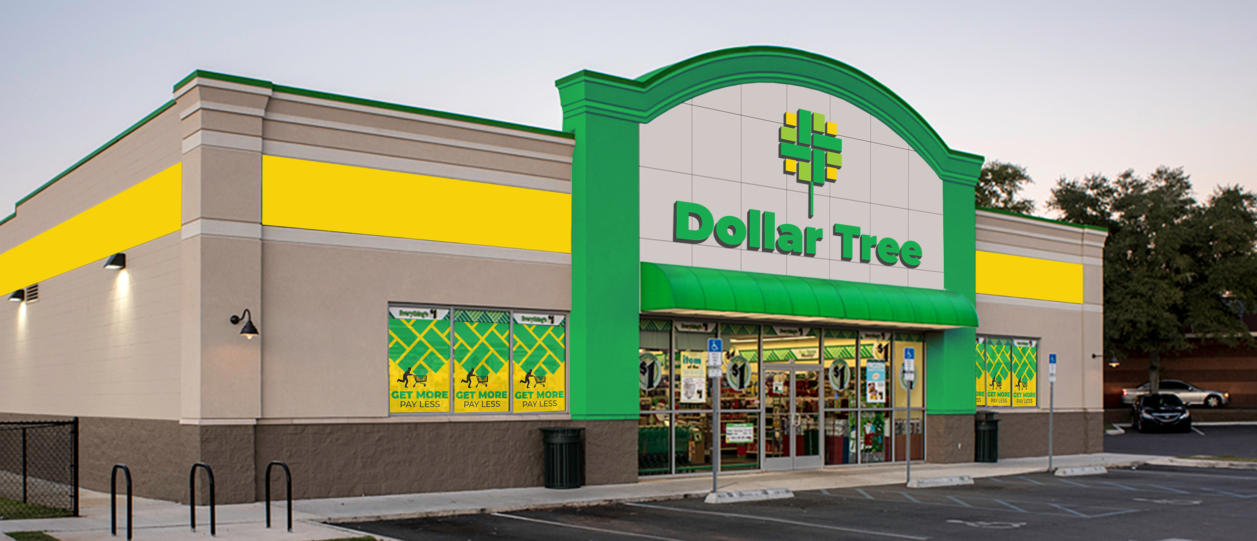
Dollar Tree
Redesign the brading of Dollar Tree, an American chain of discount variety stores that sells items for $1 or less.
- Timeframe: 5 weeks
- Roles: Branding, Logo Design, Environmental Graphics, Layout
- Skills: InDesign, Illustrator, Photoshop
Challenge
Dollar Store hacks are popular on YouTube with the core audience who are the recent college grads, first time homebuyers, and parents of young kids. They desire a well-designed home, but can’t afford designer touches and are willing to do things themselves. The challenge is to redesign the brand to make The Dollar Store more appealing visually to the core audience.
Project Goals
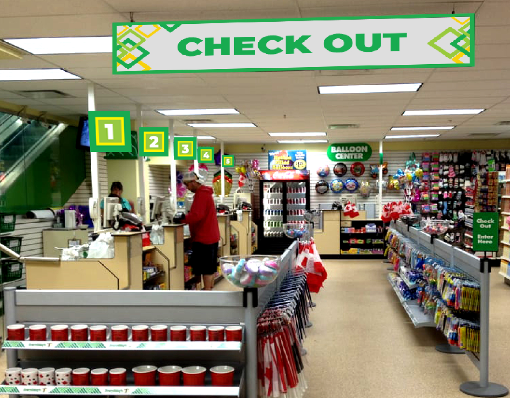
To create a branding system that reflects the friendly, accessible, and energetic store; and apply brand elements to various pieces of collateral and environmental.
Solution
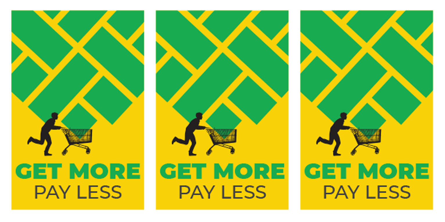
The rebrand conveys shopping at Dollar Tree as a smart, economical, and fun alternative. Targeting young customers, the visual language is vibrant, bold, and dynamic.
Process
Identifying the audience
Recent college grads, first time homebuyers, and parents of young kids. They have future earning power, but at the moment they are cash strapped
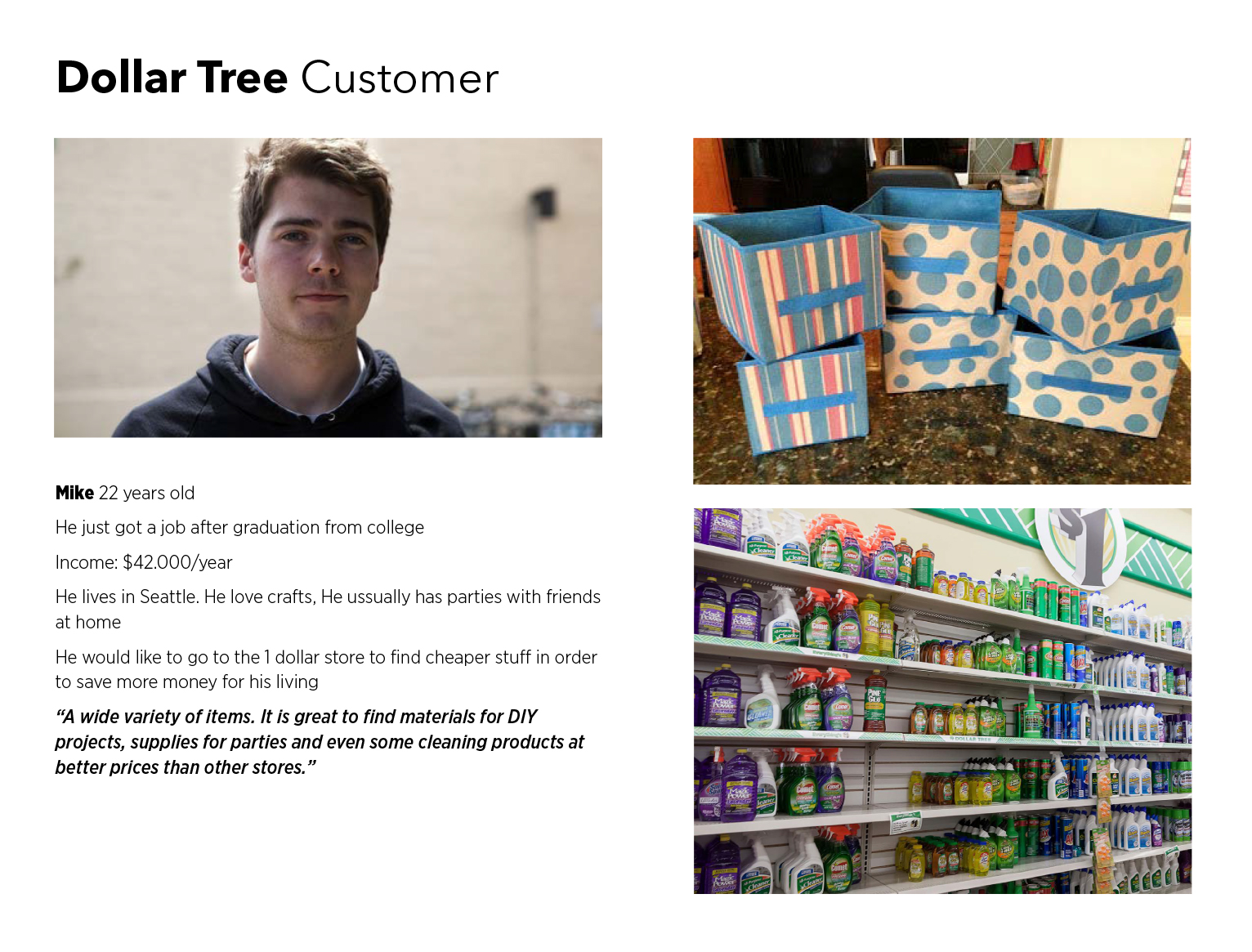

Logo Design
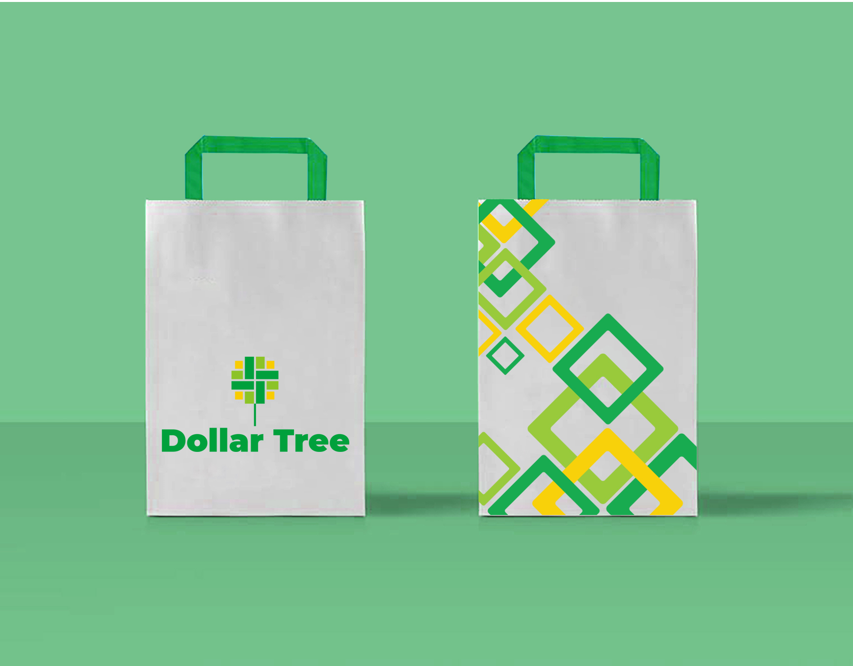
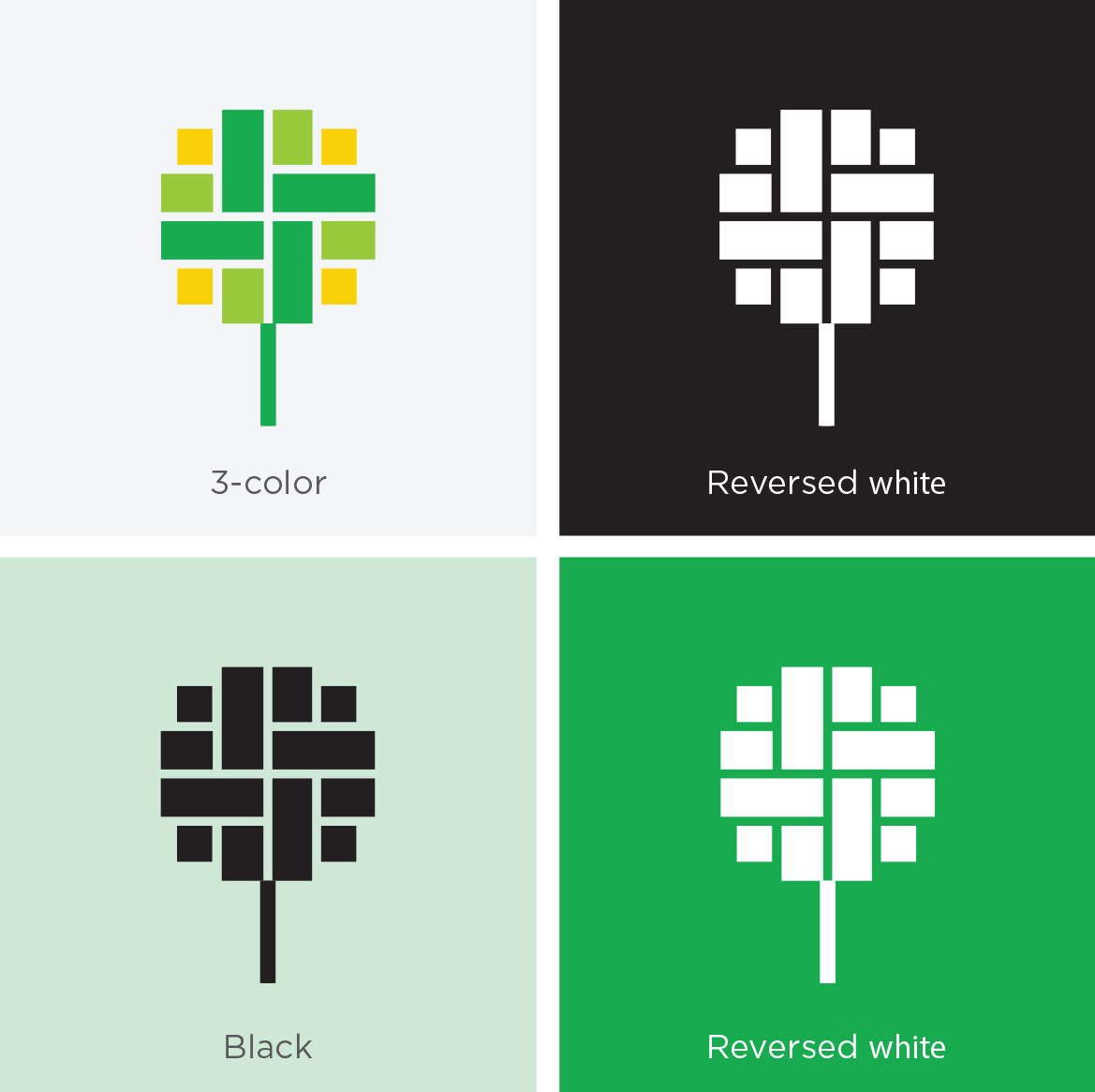
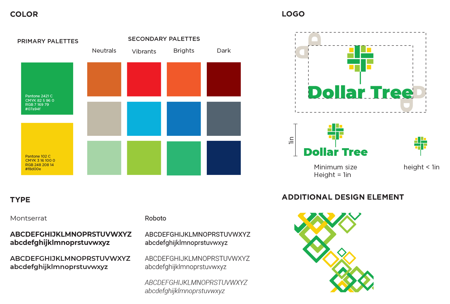
The Dollar Tree brandmark is a direct expression of its brand identity. It is friendly, affordable, and it evokes feeling of comfortable shopping but economical. At the same time, it is vibrant, reliable, and recognizable. Rectangles that represent dollar bills are arranged flexibly to form a dollar tree. The negative space between them creates a network reminiscent of the store's shopping space.
Brand guideline
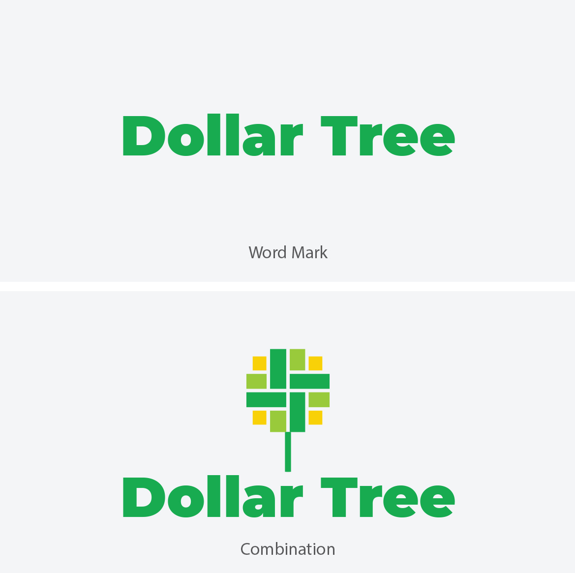
Montserrat is a attractive geometric sans-serif typeface that works best as a header. This font family is bold, dynamic, geometrically pleasing and call for a sleek, younger look.Roboto is a modern sans-serif typeface family that works well as body copy. It is friendly, yet approachable and creates more natural reading rhythm.
The brand color pallets are green and yellow. Green is the old color of the brand that alludes the color of money as well as the tree. Yellow is added to create a warm highlight that embodies energy and happiness. Yellow green are used to create connection and provide a fresh and modern feel for the brand.
Brand in Action
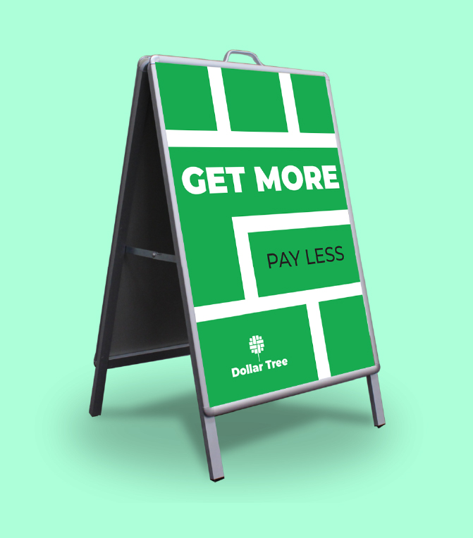
The design focuses on making the brand fresher, more friendly, and recognizable. Its color pallet and graphic elements are accessible and dynamic. The trademark is simple, easily scaled and recognized.
